Strands 1: Hendrik Kertens
Analysis
Hendrik Kertens is a Dutch photographer and visual artist. He is known for his portraits of his daughter Paula.
After the birth of his daughter Paula he took up photography to record the changes and events in his child's life. As Paula grew older, he developed himself from a documentary photographer into a visual artist specializing in staged photography.
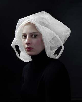
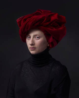
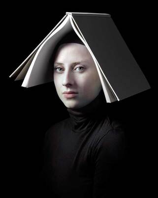
Kerstens creates carefully composed portraits that refer to the works of the Dutch Old Masters and the Italian Renaissance. These images use everyday items as props, such as a dishtowel or cream standing in for a maiden’s cloth and wig. A Dutch critic stated that Kerstens turned his portrait Bag into a modern masterpiece in a similar way Frans Hals did before him. The photograph of Paula with a red turban on her head has been compared with the portraits of Jan van Eyck.
Hendrik Kertens is a Dutch photographer and visual artist. He is known for his portraits of his daughter Paula.
After the birth of his daughter Paula he took up photography to record the changes and events in his child's life. As Paula grew older, he developed himself from a documentary photographer into a visual artist specializing in staged photography.
Kerstens creates carefully composed portraits that refer to the works of the Dutch Old Masters and the Italian Renaissance. These images use everyday items as props, such as a dishtowel or cream standing in for a maiden’s cloth and wig. A Dutch critic stated that Kerstens turned his portrait Bag into a modern masterpiece in a similar way Frans Hals did before him. The photograph of Paula with a red turban on her head has been compared with the portraits of Jan van Eyck.
Hendrik Kertens: Bag
|
Hendrik Kertens: Red Turban
|
Hendrik Kertens: Book
|
My Response
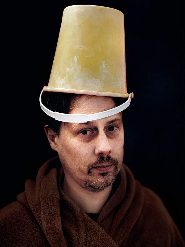
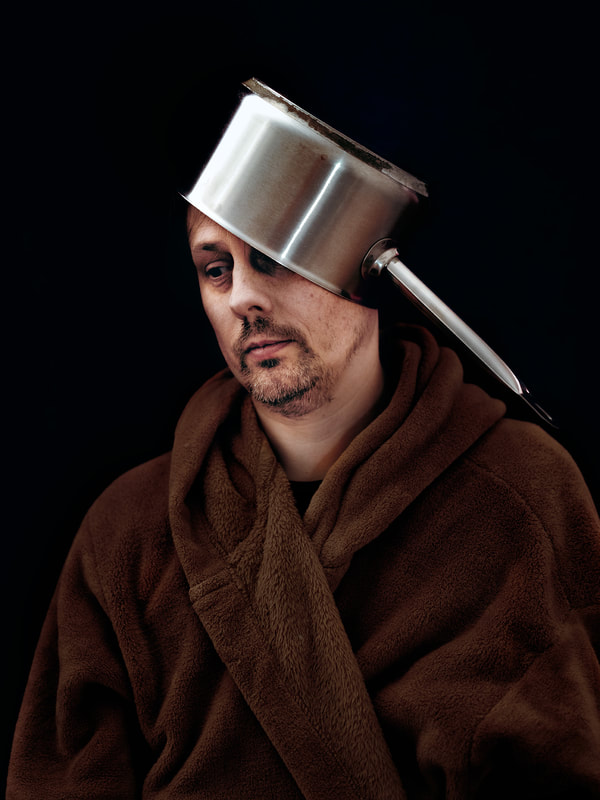
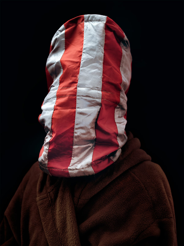
I photographed my Dad at home and tried to get the pictures to look like Kertens' pictures. I got him to wear a dark dressing gown and hung a dark purple blanket over a door to use as a background. The camera didn't have a flash so I used a camping lantern to light up the picture. I found different items around the home to use as props. These included a bucket, a saucepan, a cat's play tunnel and a book. I edited my three favourite photos in Photoshop.
Below is a slideshow of all the photos I took.
 Rembrandt self portrait
What Went Well
Using the torch to sidelight the pictures was very effective. The purple blanket worked well for the background as it looked nice and dark. The final photos look quite similar to Kertens' work but also don't look too much like I've copied the them. Photoshopping the pictures using desaturation and contrast made them look more like the work of old Dutch master portrait painters like Brembrandt.
Even Better If
I think I could have used better props for the final three images. The work of Kertens is still quite serious and using saucepans and buckets has changed the pictures to look too silly and comical.
Final Image
Below are the final three images.
Strands 2: Daniel Crooks
 Daniel Crooks: Self Portrait
Analysis
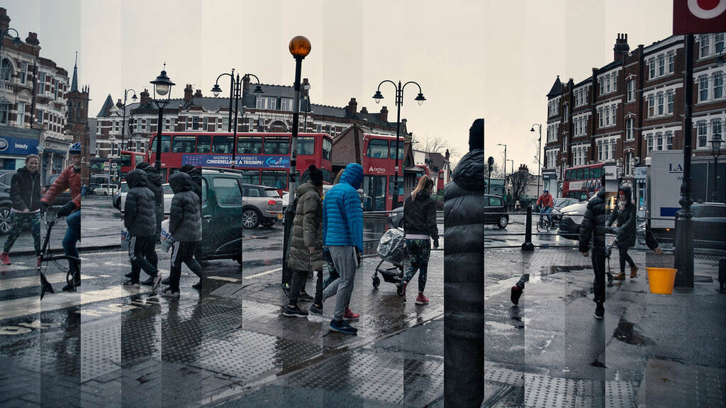
Daniel Crooks is a photographer and artist from New Zealand. He collects and combines fragments of movement in his videos and photography. In his video work Crooks poses questions around abstract concepts such as being, identity, time, and space. His portrait photography destabilises his subjects by splicing together multiple exposures.
Crooks captures and alters time and motion by manipulating digital imagery and footage as though it were physical material. He breaks time down, frame by frame. The result is works of art that can been seen as digital time slices that are subtle and not usually visible to the human eye.
Daniel Crooks: Static No. 17
My Response
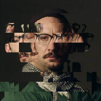
My favourite Daniel Crooks work is Static No.17. I set out to create something similar to this close to the area I live. To do this I went to several busy locations in my local high street and set the camera up on the tripod. I took dozens of pictures of each scene as people walked past. Once I had a lot of images I moved the another location and did the same. Once I was home I used photoshop to layer the frames from each location on top of each other. I then selected areas from each layer to keep and delete using the rectangular marquee tool. Once I had finished this I flattened the layers and made some contrast and colour adjustments before saving.
The slideshow below shows some of the original photos I took before editing them.
What Went Well
My final picture looks quite similar to the Daniel Crooks work. I like that the picture was made very close to my home and that you can see some of the people more than once as they move across the frame. This shows the passage of time well.
Even Better If
I could have made the strands thinner to match the Daniel Crooks picture. I like the shiny pavement in the rain, but I think the feel of the finished picture is quite gloomy. It might have been better if I chose a different day with nicer weather for the photoshoot.
Final Image
Below is the final image I made.
Strands 3: Joe Webb
Analysis
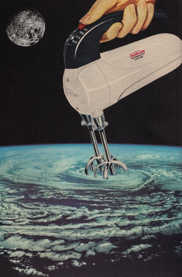
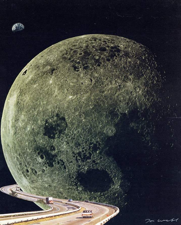
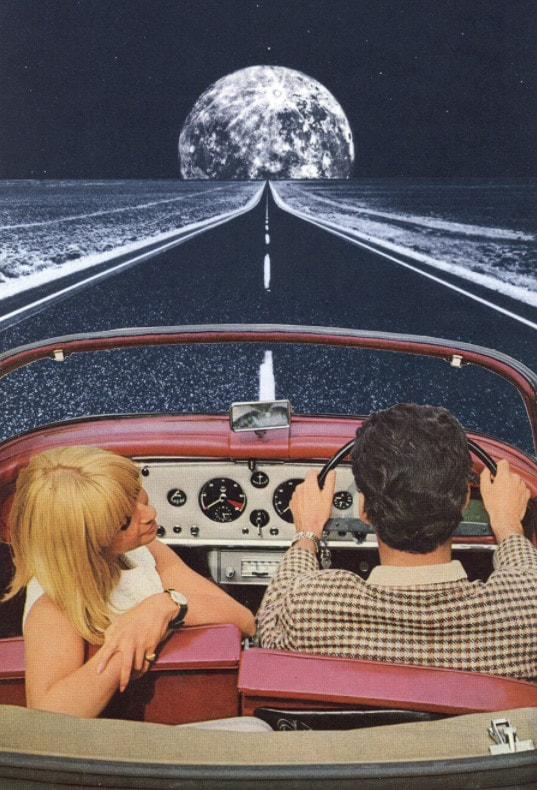
Joe Webb is a British artist who creates hand made collages with a message. Webb reimagines found imagery using simple and concise edits to make thought provoking artworks. He tackles issues such as the environment, war, inequality - and questions our place in the universe. Webb originally began making his pieces as a reaction to his computer-focused graphic design job. He enjoys the simplicity of using two or three print images to create totally new worlds.
Joe Webb plays the visual elements against each other in a way that puts different eras together, allowing characters to travel from their bland lifestyles the far cosmos. He plays with themes of nostalgia and loss but composes light-hearted images that have a lot in common with today’s sampling culture.
Joe Webb: Stirring Up a Storm
|
Joe Webb: Moonshot
|
Joe Webb: To the Moon
|
My Response
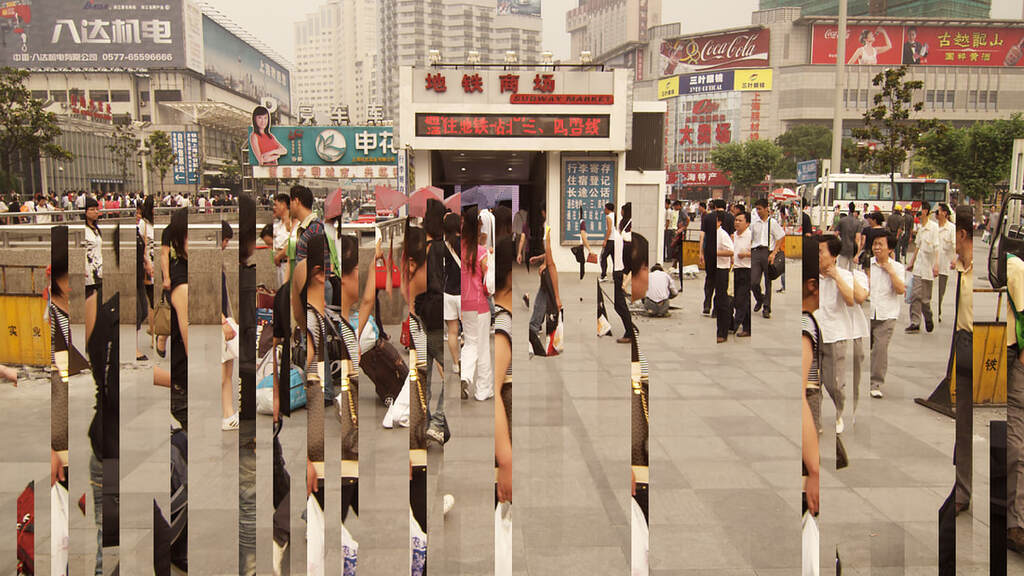
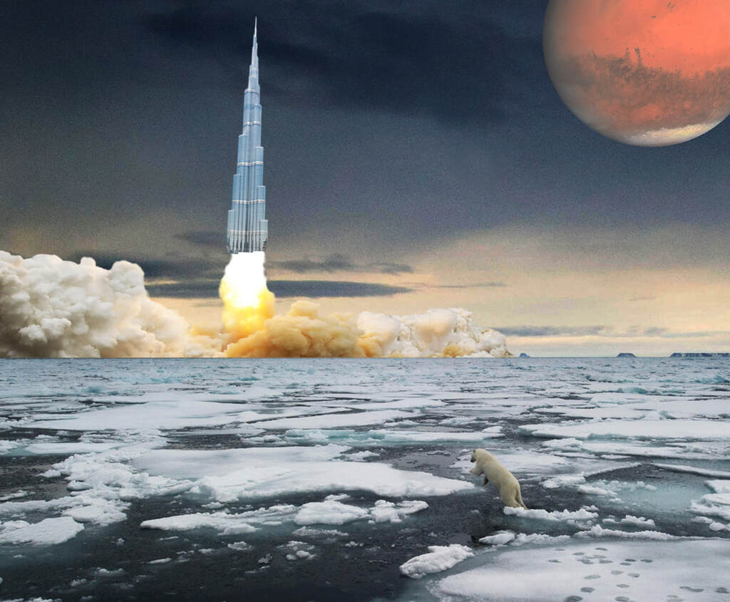
I made a collage influenced by the work of Joe Webb. I had recently watched the film Don't Look Up, which is about mankind ignoring an upcoming global disaster. I thought I could use my collage to illustrate the way we are not doing enough about climate change while still spending billions on exploring space. The project first involved collecting many images that I thought I could use as part of the collage. I included pictures of Mars, the Moon, rockets taking off, tall sky scrapers in the middle east and pictures of melting icebergs.
Below is a slideshow of the pictures I collected.
What Went Well
I enjoyed researching Joe Webb's work. This was a fun project. I thought the selection of original pictures I found using the internet was of a high quality. I decided what the final picture was going to represent first, instead of just finding a selection of nice pictures and trying to make something out of them. Cutting out the parts I wanted in Photoshop was quite easy because they had simple backgrounds and putting the pieces together as layers was quite simple. I used an image of a polar bear on melting ice to represent climate change. I used pictures of Mars and the fire and smoke from the rocket launch to represent space exploration. Finally I used a picture of the Birj Khalifa, which is the world's tallest sky scraper in Dubai, to represent man's dependence on Middle East oil.
Even Better If
The final picture is made up of photos I found on the internet. Joe Webb's work uses picture he finds in newspapers and magazine. If I have more time I could have made my collage using printed pictures instead of digital ones. Also It would have been nice to include some photos I took myself in the final image.
Final Image
Below is the collage I made using the photos I found.
Strands 4: Further Development
 My original Daniel Crooks photo.
Introduction
I really liked making the images in the style of Daniel Crooks. I thought the pictures I took were very effective at showing the passage of time. I tried to create another image that showed the passage of time over a much longer period. To do this I set my camera up on a tripod at home and took a picture every ten minutes during sunset. I ended up with a series of photos showing the city of London as it got dark. I then used Photoshop to layer each photo on top of each other. I used the grid in Photoshop to select parts of each layer to either delete or keep.
Below is a slide show of the pictures I took for this project.
What Went Well
Using the tripod was essential to make sure the composition was the same each time. I used the aperture priority mode on the camera for each picture. This meant that the camera automatically worked out the exposure time so I didn't have to make any adjustments for each picture. The colours in the sky dimmed in each photograph and the ones where the sky is pink are very pretty. The set of pictures show the city lighting up as the city gets darker.
Even Better If
I think it would have been better if I took the pictures over a longer period of time. This would have meant I had more pictures with more variation in light. The three final images I made are below. I think that I could have experimented more with the shapes of each layer. For example instead of using squares and stripes I could of used circles or overlapping shapes for more variety. The weather conditions where the same for each picture, if I did it on a different day the sky might have looked more interesting.
Image One
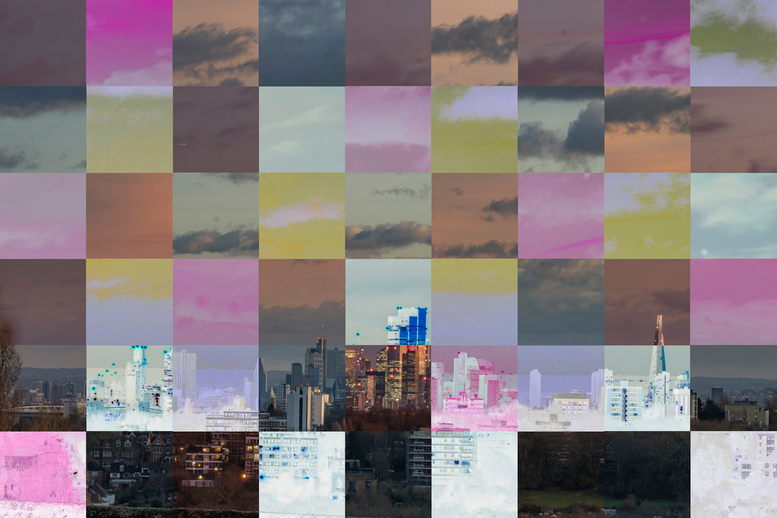
For my first picture I chose squares as my shape to show the different layers. I think this looks a little bit messy.
For my first picture I chose squares as my shape to show the different layers. I think this looks a little bit messy.
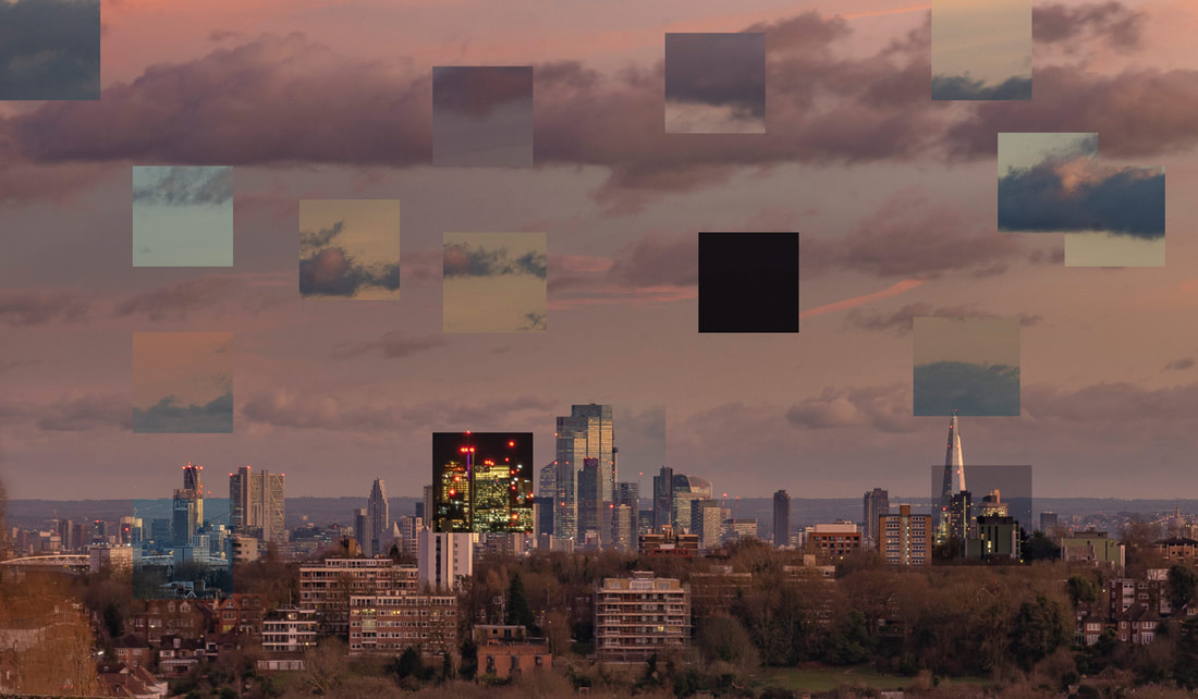
Image Two
For my next picture I just used stripes showing the city getting darker from left to right. This looks better than the first one but there are not enough stripes.
For my next picture I just used stripes showing the city getting darker from left to right. This looks better than the first one but there are not enough stripes.
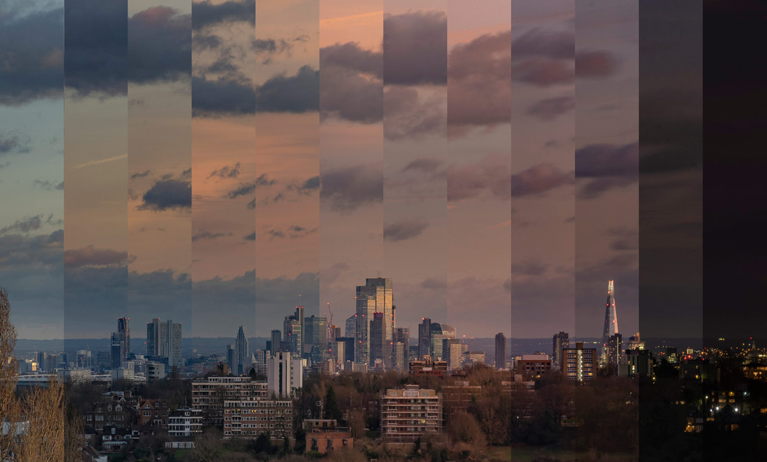
Image Three
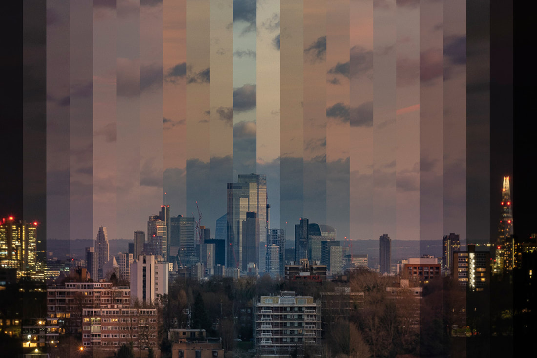
For my final version I doubled the amount of pictures used to create the effect of it getting light and going dark again. Because I didn't have pictures of it getting light in the morning I just duplicated the layers and used them twice.
For my final version I doubled the amount of pictures used to create the effect of it getting light and going dark again. Because I didn't have pictures of it getting light in the morning I just duplicated the layers and used them twice.
Further Work
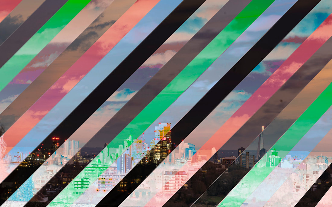
I decided that I really liked this project so I continued to experiment with the photos. I changed the technique to include diagonal lines, triangles, and circles. I also tried inverting the image to be a negative of the original as changing the colours. These are shown below.
I decided that I really liked this project so I continued to experiment with the photos. I changed the technique to include diagonal lines, triangles, and circles. I also tried inverting the image to be a negative of the original as changing the colours. These are shown below.
Strands Further Development Project Summary
What Went Well
I thought that all of the projects were interesting because they were all different from each other. I enjoyed the Hendrik Kertens project as it gave me a hance to take some nice portraits using good lighting and it was fun to set it up at home. I liked the Daniel Crooks and Joe Webb projects because I learned a lot about using layers in Photoshop. The Joe Webb one was my favourite because I could use the technique outside in the street like he did or just at home for the shot of the city.
Even Better If
I think the Hendrik Kertens pictures are fun but are a bit too silly. If I had a bit more time to plan I would have made them have a more serious feel buy using different props. The Joe Webb set of images could have been improved by photographing a different range of environments in different type of weather and light
Final Further Development Project
Introduction
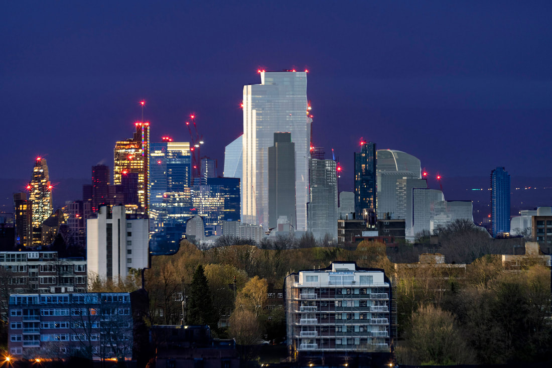
For my final Strands project I wanted to use the same technique I used for the previous Joe Webb city scape photos. Once again I photographed the city of London from the back of our home. I borrowed a 400mm lens so I could zoom in further on the city of London. I set the camera up on a tripod and programmed it to take a picture every 15 minutes. I started the process at 5:30am when it started to get light, all the way through the day until it got dark. I ended up with too many pictures so I edited them down to my favourite 30. I used the same technique as before to layer the photos on top of each other in Photoshop, then delete a section of each photo so the one underneath it shows through. Below is a slideshow of the pictures I chose to use.
For my final Strands project I wanted to use the same technique I used for the previous Joe Webb city scape photos. Once again I photographed the city of London from the back of our home. I borrowed a 400mm lens so I could zoom in further on the city of London. I set the camera up on a tripod and programmed it to take a picture every 15 minutes. I started the process at 5:30am when it started to get light, all the way through the day until it got dark. I ended up with too many pictures so I edited them down to my favourite 30. I used the same technique as before to layer the photos on top of each other in Photoshop, then delete a section of each photo so the one underneath it shows through. Below is a slideshow of the pictures I chose to use.
Final Images
Image One
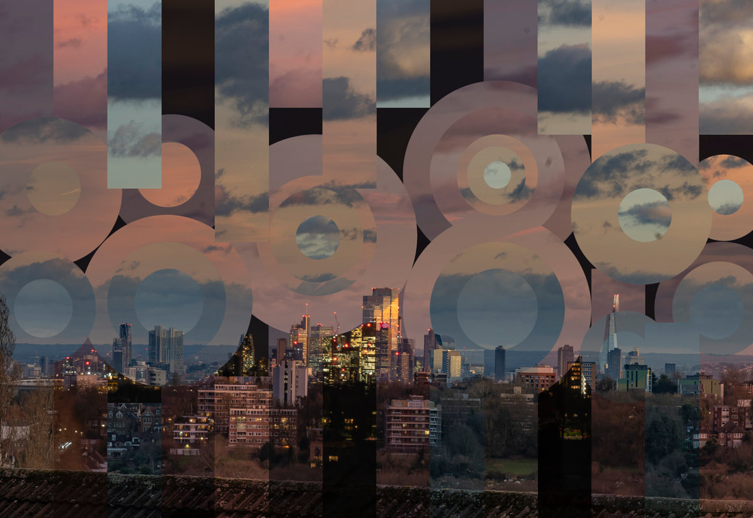
For the first image I divided the image into 30 vertical stripes using the grid overlay in Photoshop. The slices to the left are during sunrise and the ones on the right are during sunset. This give a time line of the day. I only used a few images taken while the sun was up as the light did not change very much during these hours.
Image One
For the first image I divided the image into 30 vertical stripes using the grid overlay in Photoshop. The slices to the left are during sunrise and the ones on the right are during sunset. This give a time line of the day. I only used a few images taken while the sun was up as the light did not change very much during these hours.
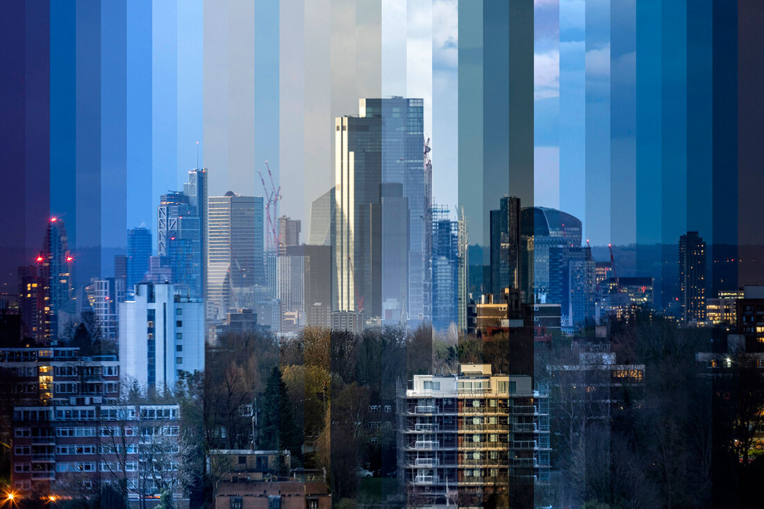
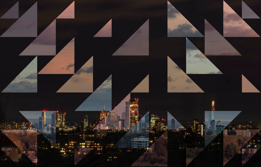
Image Two
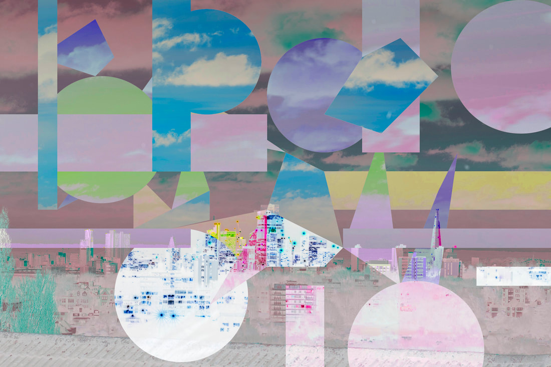
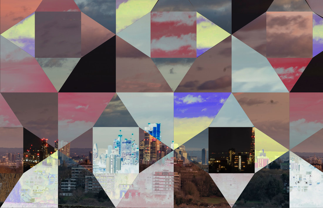
For this image I selected just eight of the original 30 pictures. I then used triangle shapes to select and deleted areas of each layer. The final effect is very nice and it reminds me of the glass on the Gherkin building in central London.
For this image I selected just eight of the original 30 pictures. I then used triangle shapes to select and deleted areas of each layer. The final effect is very nice and it reminds me of the glass on the Gherkin building in central London.
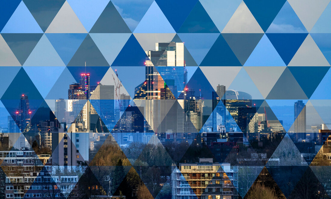
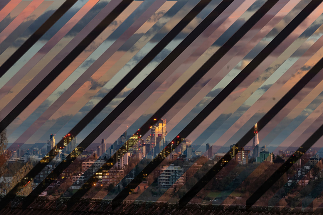
Image Three
For this image I only used the eight darkest pictures from the day. I chose four from the morning and four from the evening. This means that the lights are on in the city in every image and the final picture has a nice dark blue colour. I drew diagonal lines across the picture to select the parts of each layer I wanted. I think this has a more interesting effect than the vertical lines.
For this image I only used the eight darkest pictures from the day. I chose four from the morning and four from the evening. This means that the lights are on in the city in every image and the final picture has a nice dark blue colour. I drew diagonal lines across the picture to select the parts of each layer I wanted. I think this has a more interesting effect than the vertical lines.
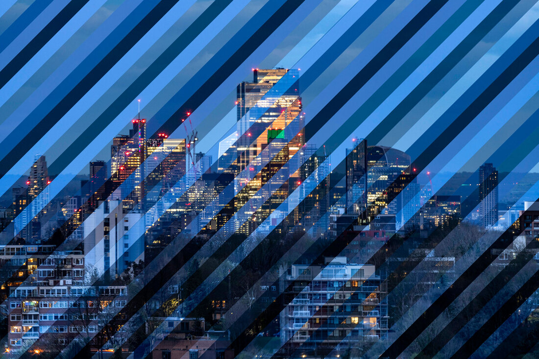
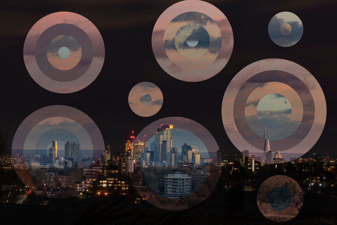
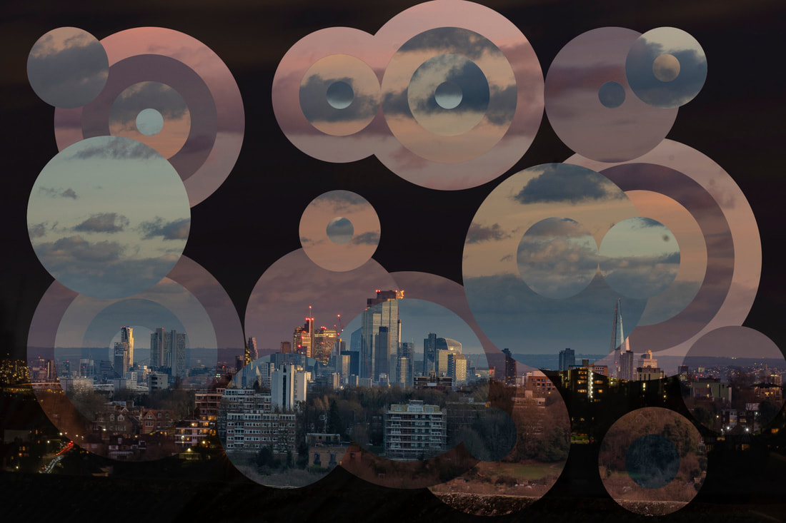
Image Four
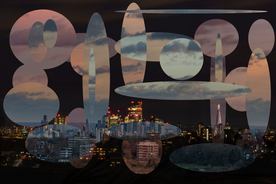
The this image I chose the eight lightest images from the day. I think that this gives a very different feel to the dark blue one. Instead of using lines I drew circles to selected the parts I wanted to keep on each lay. I also overlapped some of the circle which gives a nice effect.
The this image I chose the eight lightest images from the day. I think that this gives a very different feel to the dark blue one. Instead of using lines I drew circles to selected the parts I wanted to keep on each lay. I also overlapped some of the circle which gives a nice effect.
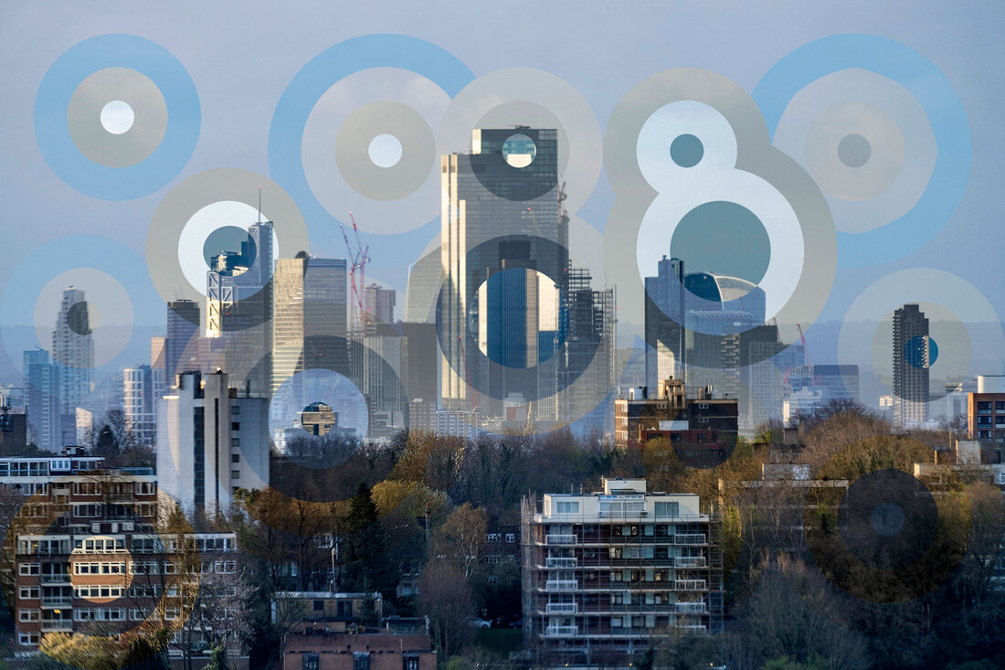
Image Five
For the final image I used the pen tool in Photoshop to draw around the separate buildings. I wanted to select different building on each layer and I hoped that the final image would be made up of pictures of building taken at different times of day. It was very difficult to do and I think the pictures above work better.
For the final image I used the pen tool in Photoshop to draw around the separate buildings. I wanted to select different building on each layer and I hoped that the final image would be made up of pictures of building taken at different times of day. It was very difficult to do and I think the pictures above work better.
What Went Well
I really liked this project and I think the final pictures are very nice. I thought using the zoom lens worked well to zoom all the way into the buildings. Using the timer on the camera was very useful because all I need to do was press the shutter button for the first picture and I could leave the camera on the tripod for the rest of the day.
Even Better If
The main thing I don't like about this set of pictures is that the sky is a bit similar in each one. My earlier pictures had more sky in them and the colour of the sky changes in them, including ones where it went a nice pink colour. It would have been nice if I had more variation in the colours of each picture.
