Development
Steve Purnell
 One of Steve Purnell's images
Analysis
Steve Purnell is a photographer from Wales. Some of his work work is inspired by the Op Art movement. It is a style of visual art that makes use of optical illusions. Major exponents of this type of art were Victor Vasarely and Bridget Riley. In these images he uses striped backgrounds and also projected images that are distorted through water that is placed in bottles and glasses.
My Response
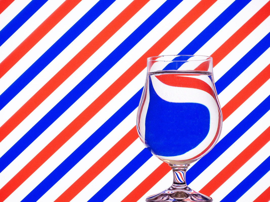
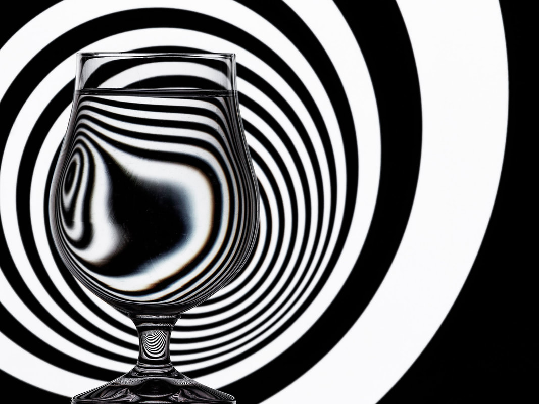
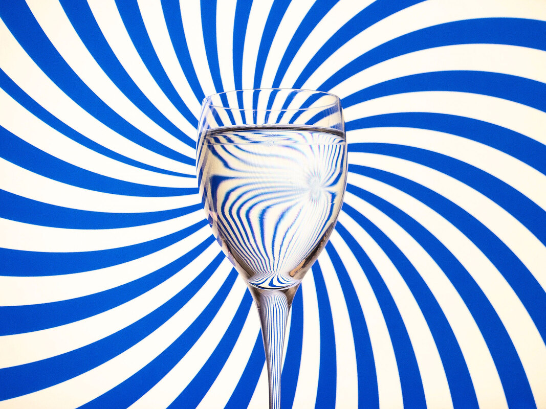
I made a series of images in the style of Steve Purnell's Op Art work. For this I used a selection of backgrounds displayed on a computer monitor. This meant I did not need to print anything out. I photographed three different glasses and a vase in front of each background.
Steve Purnell is a photographer from Wales. Some of his work work is inspired by the Op Art movement. It is a style of visual art that makes use of optical illusions. Major exponents of this type of art were Victor Vasarely and Bridget Riley. In these images he uses striped backgrounds and also projected images that are distorted through water that is placed in bottles and glasses.
My Response
I made a series of images in the style of Steve Purnell's Op Art work. For this I used a selection of backgrounds displayed on a computer monitor. This meant I did not need to print anything out. I photographed three different glasses and a vase in front of each background.
What Went Well
Using backgrounds displayed on a computer screen was a good idea because I could alter the brightness of the display and rotate them. I thought the three glasses all gave a different interesting effect. I closed the blinds in the rooms to stop too much glare reflecting off the glasses. This meant the room was quite dark so I used a high ISO and large aperture.
Even Better If
I think that if I could have controlled the lights in the room without them reflecting on the glass I could have used a quicker shutter speed. I had to take about 100 photos to get 30 pictures that are worth keeping because so many of them were blurry. I could have used a tripod to help me avoid having so many blurry photos.
Top Three
Below are my three favourite images from the project. I have cropped and edited them in Photoshop.
Ed Ruscha
 One of Ed Ruscha's Seven Products
Analysis
Ed Ruscha is an American artist associated with the pop art movement. He uses painting, printmaking, drawing, photography, and film. Ed Ruscha takes photos of objects that you wouldn't really see as art. He worked on a project entitled Seven Products. These black and white images are of everyday objects found in a normal household in the 1950’s. The images are taken at the same angle and viewpoint and are always on a plain white background.
My Response
I made a series of images in the style of Ed Ruscha's Seven Products. For this I chose seven products from my kitchen. I made a white background using sheets of A4 paper. I converted the photos to black and white using Photoshop. The finished black and white images and the original colour photos are displayed in the slideshow below.
What Went Well
I think the black and white versions of the photos look very similar to Ed Ruscha's original photos. I used light from the window to cast a nice shadow on the paper. When I converted the images to black and white I also added contrast which looks nice. I also used the healing tool in Photoshop to remove the lines between the overlapping sheets of paper.
Even Better If
I could have been more careful with the composition because I had to crop and rotate some of the pictures to make them look all the same. I also think I could have left more space around the larger objects. It required a lot of work to get rid of the overlapping lines on the sheets of paper. It would have been better if I had a single larger piece of paper to use as a background. Ed Ruscha's photos have a yellowish sepia tone to them instead of being pure black and white. I could have added a sepia effect in Photoshop to make them look more like his.
Jesse Draxler
 Art by Jesse Draxler
Analysis
Jesse Draxler is an artist and photographer who currently lives in California. He works in many different mediums that combines collaged photography and painting. Draxler distorts and overlaps his models’ bodies and faces to form abstract forms and beings. His work is all in black and white because he feels colour is distracting.
My Response
I made a single image is the style of Jesse Draxler. I took a series of photos of a model and printed them out. I then cut them up and arranged them to form a new image. The separate pieces were arranged face down on a scanner to make the final image.

What Went Well
The photos I made of the model were good quality. I made six photos in total. I was worried that six wasn't enough, but in the end it was ok. I had to direct the model on how to pose for the six photos. I had a clear idea on how I wanted her to be positioned. The best part of this project for me was being well prepared for the photography.
Even Better If
I printed the photos quite small to save on ink. This meant that it was quite difficult to cut out the shapes. It would have been much easier if I has printed them very large. The edges of Jesse Draxler's pictures have a more interesting shape. Mine is not as good because of the shape of the model's long hair. I think if I had photographed someone with short hair or her hair tied back it would have meant the edges of my collage would have a more interesting shape.
