Composition
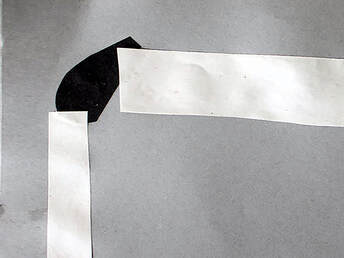 Collage showing the rule of thirds
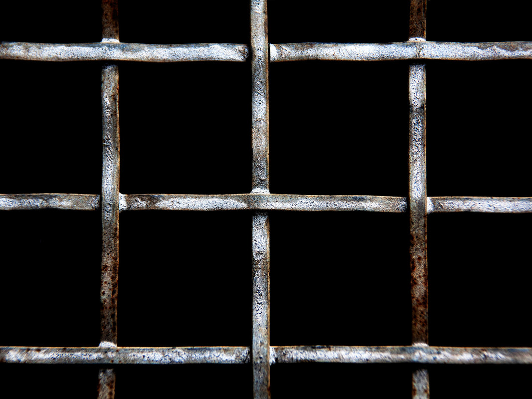
Rule of Thirds
The rule of thirds is a guide to help composition where photos are divided into thirds with two imaginary lines vertically and two lines horizontally. Important compositional elements are placed on or near the imaginary lines and where the lines intersect.
The rule of thirds is a guide to help composition where photos are divided into thirds with two imaginary lines vertically and two lines horizontally. Important compositional elements are placed on or near the imaginary lines and where the lines intersect.
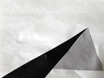 Collage showing the use of triangles
Triangles
Photographers can arrange subjects within a composition into a triangle shape. It is a way of enhancing a composition. The triangles can be used to fill the frame or balance the image. The triangles can be created by any objects and can form a stable and solid composition if the base of the triangle lies along the bottom of picture.
Photographers can arrange subjects within a composition into a triangle shape. It is a way of enhancing a composition. The triangles can be used to fill the frame or balance the image. The triangles can be created by any objects and can form a stable and solid composition if the base of the triangle lies along the bottom of picture.
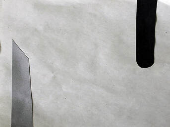 Collage showing objects providing balance
Balancing
Balance helps to guide the viewer’s image around the image without resting too heavily on any one particular part. Balance can be achieved in a photograph by using symmetry, placing objects of interest on both side of the picture and using contrast so the light or dark areas of a picture are not too close to one side of the photo.
Balance helps to guide the viewer’s image around the image without resting too heavily on any one particular part. Balance can be achieved in a photograph by using symmetry, placing objects of interest on both side of the picture and using contrast so the light or dark areas of a picture are not too close to one side of the photo.
 Collage showing the use of layers
Layering
Layering is a method used to give a photograph a sense of depth. This can be done by separating the composition into foreground, middle and background. A picture that includes all three will lead the view into the frame and be more interesting.
Layering is a method used to give a photograph a sense of depth. This can be done by separating the composition into foreground, middle and background. A picture that includes all three will lead the view into the frame and be more interesting.
My Response
I made a series of pictures to show how the composition ideas work in real life.
I made a series of pictures to show how the composition ideas work in real life.
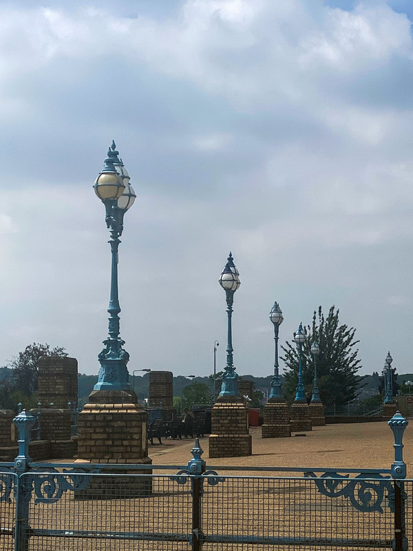
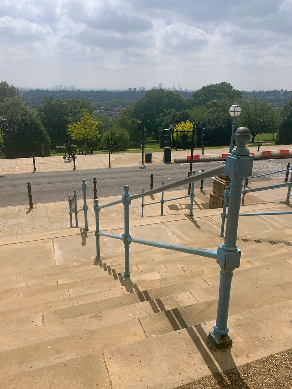
Left hand side lamp post and horizon use rule of thirds
Triangles and layers
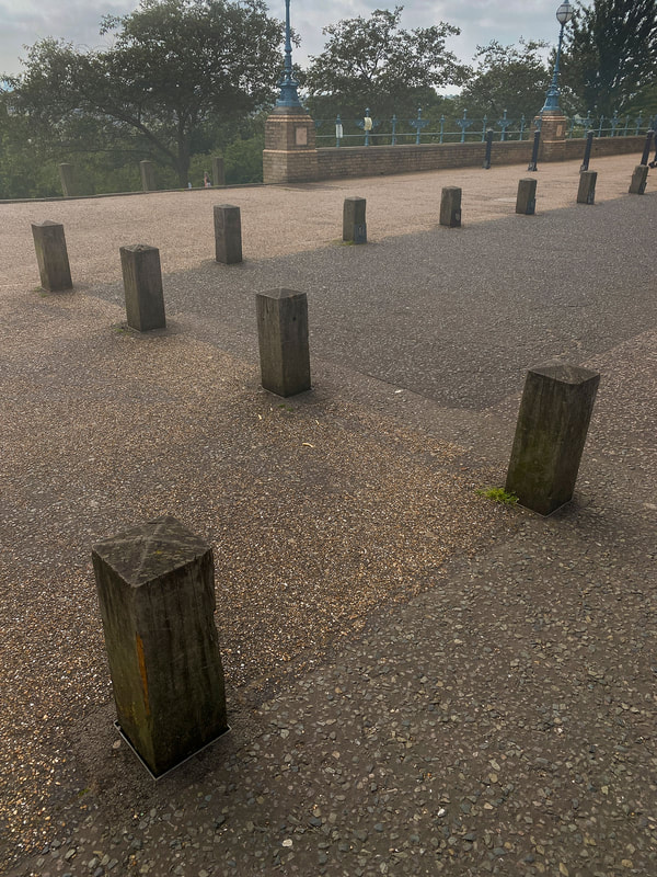
Posts make triangle shapes
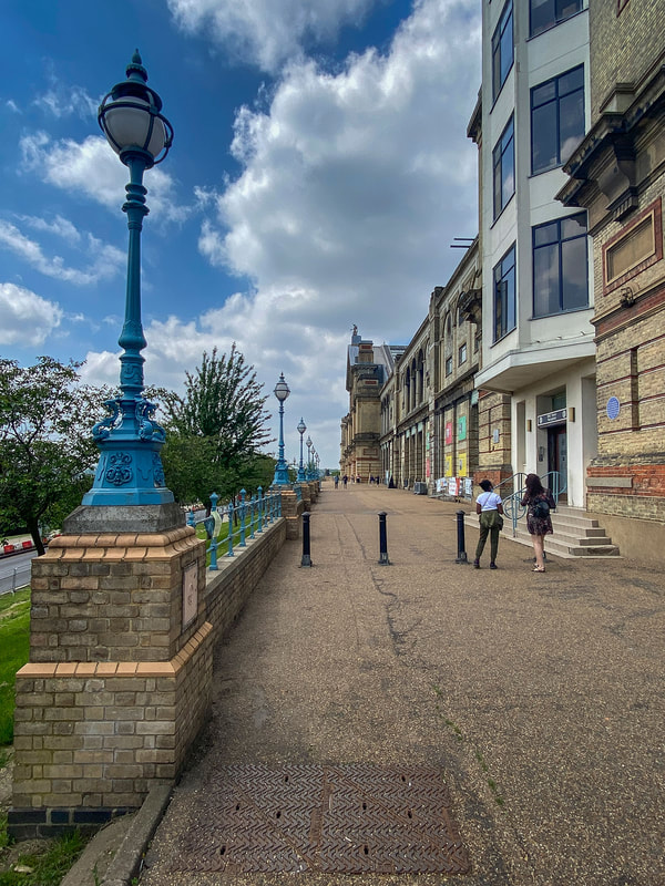
Lamp posts used to balance with the building. Also there are triangle shapes
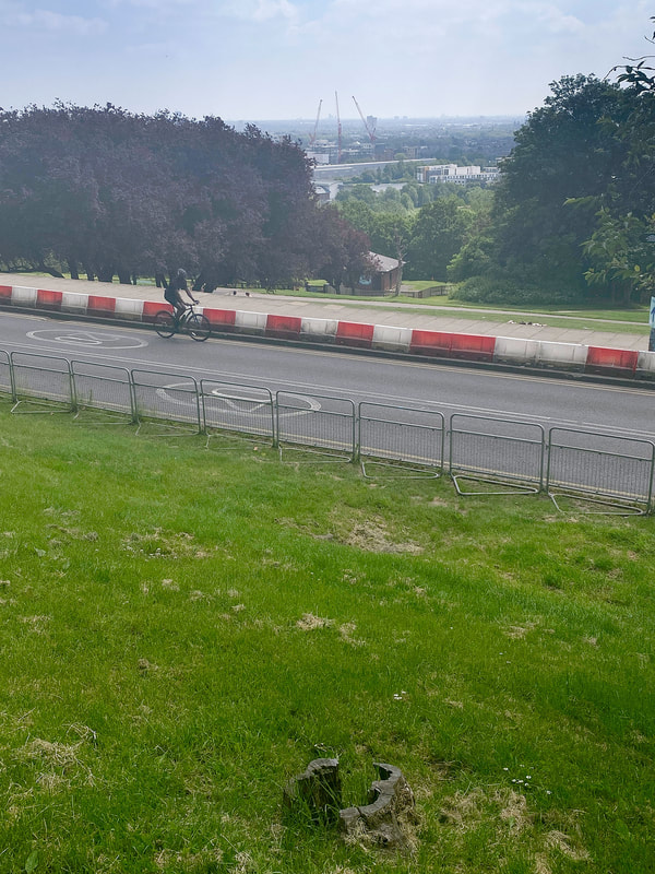
Composition uses layers
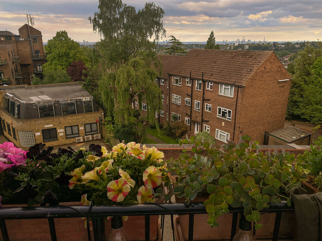
Photo taken from my home using layers
Sebastian Magnani
 One of Sebastian Magnani's Reflections
Analysis
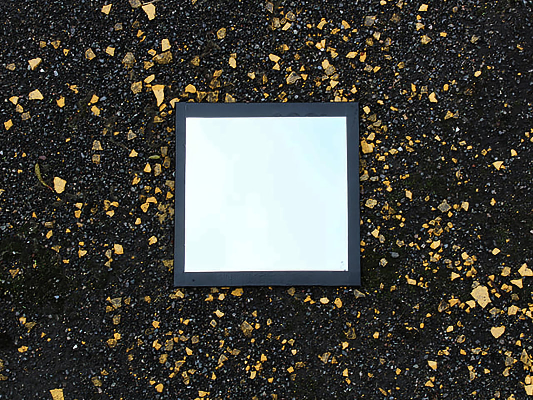
Sebastian Magnani is a Swiss photographer. In 2011 he decided to leave his traditional job at an advertising agency to follow his dream and become a photographer. His works have been featured in the New York Times, ABC news and BBC news. He has a project called Reflections where he uses a round mirror placed on the surface he is photographing. He then makes his compositions so the area behind him is reflected in the mirror.
My Response
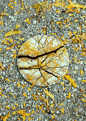
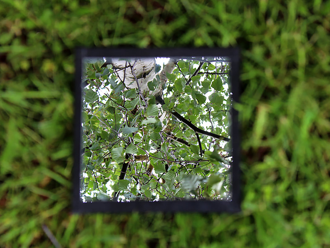
I made a series of images in the style of Sebastian Magnani’s Reflections project. I used a square mirror and took the photographs around my school and local park.
Sebastian Magnani is a Swiss photographer. In 2011 he decided to leave his traditional job at an advertising agency to follow his dream and become a photographer. His works have been featured in the New York Times, ABC news and BBC news. He has a project called Reflections where he uses a round mirror placed on the surface he is photographing. He then makes his compositions so the area behind him is reflected in the mirror.
My Response
I made a series of images in the style of Sebastian Magnani’s Reflections project. I used a square mirror and took the photographs around my school and local park.
What Went Well
I managed to find two backgrounds that worked very well with the floor. These are the birch tree and the car wheel. The pictures with the trees used the mirror on the ground just like Sebastian Magnani. I also experimented with leaning the mirror on the wall. Even though this is not what Sebastian Magnani does, I think the it still worked well.
Even Better If
It was difficult to find enough interesting things to reflect in the mirror. This is because the photos were taken in the school car park. The photos might have looked better if I was in a better location. I focused on the reflections in the mirror but the backgrounds are blurry. This is because the depth of field is too shallow. I could have used a smaller aperture to try and bring it into focus.
Top Three
Below are my three best images from the project.
Andy Yueng
 A photo from Andy Yueng's Look Up project
Analysis
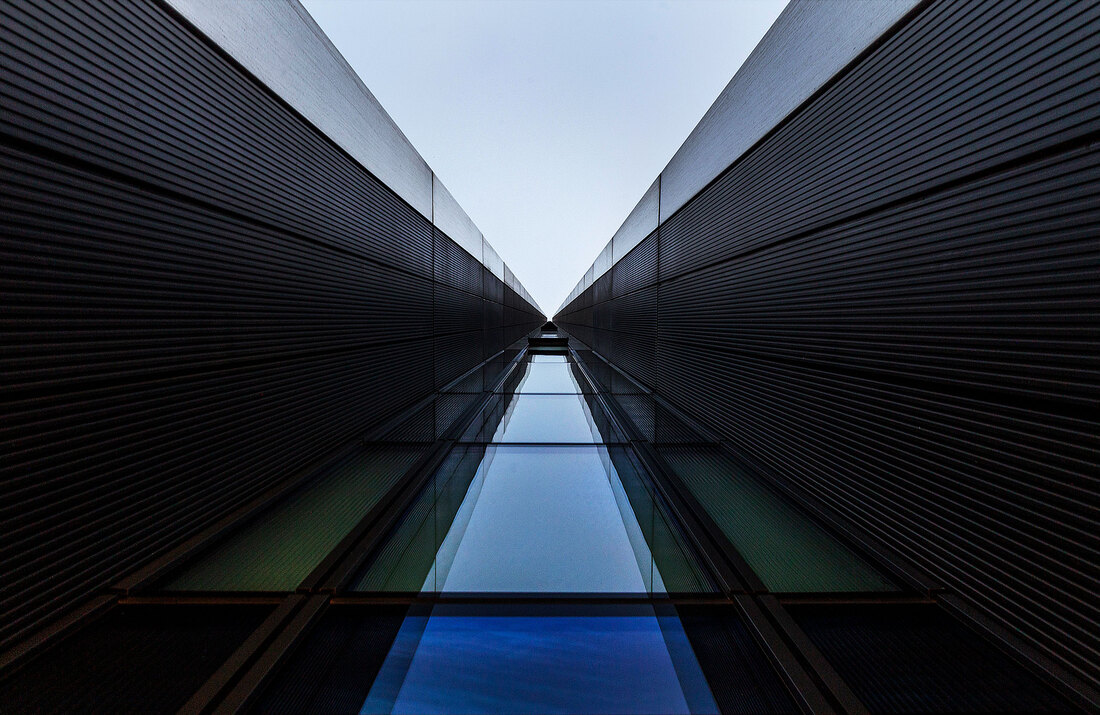
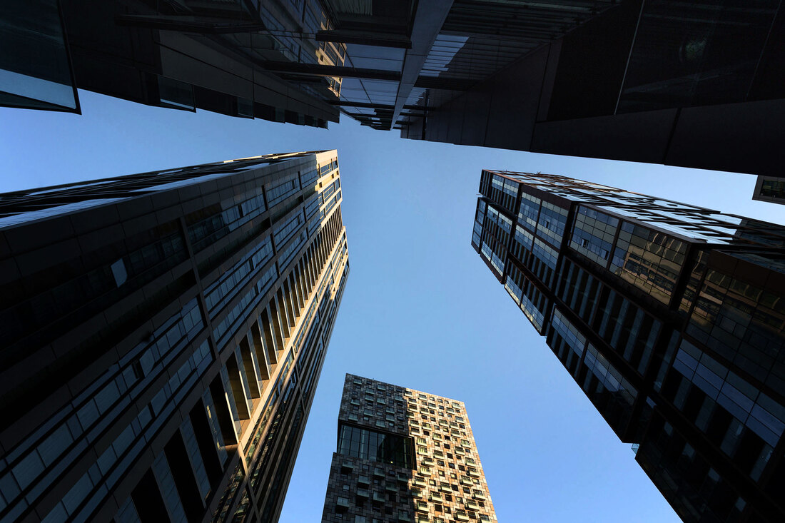
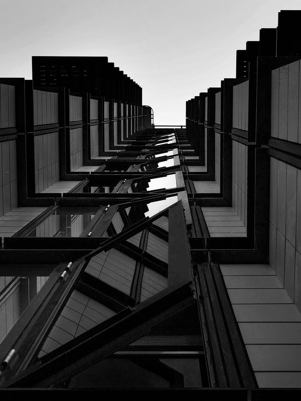
Andy Yeung is a landscape, architecture and aerial photographer based in Hong Kong. His recent projects include aerial photography of the city of Hong Kong using a drone, and a series of photos looking up to the sky along the side of buildings
A lot of his work is of lit up buildings at night or they are taken during the day in dramatic weather. There is good use of colour in the pictures either by the way the buildings are painted and arranged or from the natural light. I think that Andy Yeung is trying to show us what it is like to live and work in a city with a very high population. Even though there are no people in his pictures, it feels like the city is full of people living and working on top each other.
My Response
I made a series of images in the style of Andy Yeung’s Look Up project. I travelled into the Docklands area of London where there a lot of tall buildings close together. I tried to use the sides of the towers so the tops of them retreat into the distance.
What Went Well
I think that making the effort to travel to the Docklands was a good decision. It allowed me to photograph very tall buildings that look similar to the ones Andy Yueng has in Hong Hong. I think going to the Docklands in the evening was a good idea because the light was better. It helped bring out the colours of the buildings and there were nice light and shadow areas. I am very happy with the way the pictures turned out because some of them really look like Andy's work.
Even Better If
It was quite difficult to find an area where the buildings were as close together as the ones Andy photographs, but this is because London is more spread out than Hong Kong. A lot of Andy's photos are symmetrical and lead to a point in the middle of the composition. I found it hard to find a composition that was symmetrical using the buildings in Docklands. I also think that if I had a very wide angle lens I could have fitted more of the lower part of the buildings in.
Top Images
Below are my best images from the project.


Romain Jacquet-Lagrèze
Nature vs Manmade
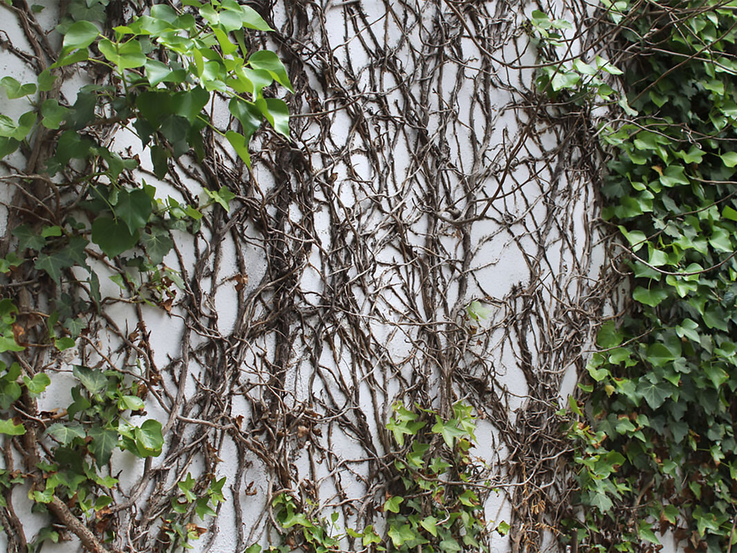
Romain Jacquet-Lagrèze is a French photographer based in Hong Kong. He has been photographing the city since 2010. He has several projects, one of them is called Wild Concrete where he photographs plants and trees growing from buildings in the city. The pictures show how nature starts to take over the man made environment if it is left alone.
Analysis of three Romain Jacquet-Lagrèze photos
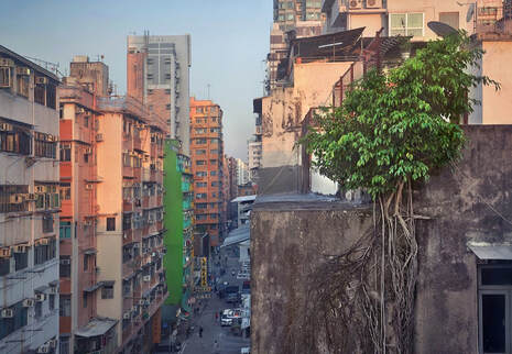
Photo 1
This is a wide shot of the city. It shows the area is residential and busy. Even though the area is heavily used by humans, nature is still strong enough to claim a space to survive. This photograph shows both the man made environment and nature in one straight forward scene. This has shown me that it's quite important to include a wide picture that can show what the project is about.
This is a wide shot of the city. It shows the area is residential and busy. Even though the area is heavily used by humans, nature is still strong enough to claim a space to survive. This photograph shows both the man made environment and nature in one straight forward scene. This has shown me that it's quite important to include a wide picture that can show what the project is about.
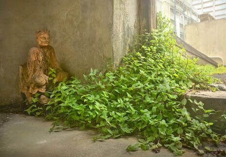
Photo 2
This photograph shows some close up detail within the city. The main focus of the photograph is the plant taking over the manmade environment. Romain has used a low angle to take the picture, this makes it more interesting. It is like seeing the city from the point of view of a cat or fox. This photo has shown me that it is important to try lots of different angles and view points with my photography.
This photograph shows some close up detail within the city. The main focus of the photograph is the plant taking over the manmade environment. Romain has used a low angle to take the picture, this makes it more interesting. It is like seeing the city from the point of view of a cat or fox. This photo has shown me that it is important to try lots of different angles and view points with my photography.
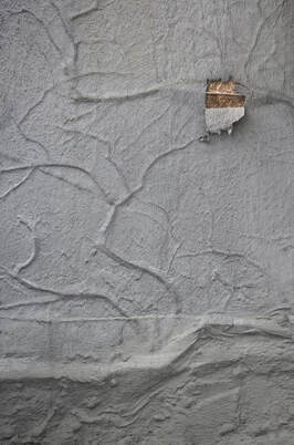
Photo 3
At first this photo looks grey and boring but when you look closer you can see there is more
going on in it. Even though you can't see the plant, you can still imagine it's struggle to survive between the two man made surfaces. I think this is quite an interesting way to illustrate nature reclaiming its place in the city. This photo has taught me to look for details and things that are not obvious at first to include in my projects.
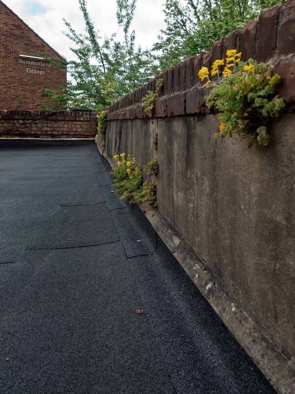
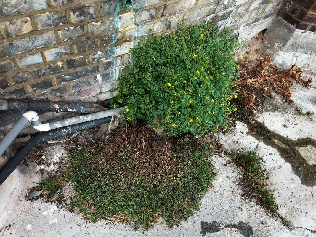
My Response
I made a series of images in the style of Romain Jacquet-Lagrèze's Wild Concrete project. I took the pictures at school and in a small concrete area behind where I live.
I made a series of images in the style of Romain Jacquet-Lagrèze's Wild Concrete project. I took the pictures at school and in a small concrete area behind where I live.
What Went Well
Some of the photos I took looked similar to Romain's work, especially the ones where I used a very low angle. There was a good variety of nature growing in the area's I choose to photograph, this helps keep the images interesting. I thought that the photos taken near my home are better than the ones I took as school. I think this is because I was not rushing to do them before the lesson was over.
Even Better If
I think if I had used different apertures the pictures could have been improved. I used the same depth of field for each photo and they look a bit similar. I also think that I could have included some wider shots where you can see more of the environment.
Top Six
Below are my six best images from the project.
Independent Development
Eliot Porter
Analysis
Eliot Porter was an American photographer noted for his detailed colour images of landscapes and birds. Porter’s early photographs of birds were in black and white, but in the early 1940s he began using colour film. He used large format camera and because the camera was so large he sometimes had to wait days for specific birds to perch near him. Porter’s photography shifted from birds to natural landscapes. Porter was active in the cause of environmental preservation and had several books publish before his death.
Eliot Porter was an American photographer noted for his detailed colour images of landscapes and birds. Porter’s early photographs of birds were in black and white, but in the early 1940s he began using colour film. He used large format camera and because the camera was so large he sometimes had to wait days for specific birds to perch near him. Porter’s photography shifted from birds to natural landscapes. Porter was active in the cause of environmental preservation and had several books publish before his death.
Shadbush by Eliot Porter
|
Redbud Trees by Eliot Porter
|
Photographers Intensions
Eliot Porter intended to show his deep love for the wilderness and the environment.
He did this by spending a lot of time trekking in the wilderness to find his compositions.
He wanted us to think about how beautiful the natural world is and how important conservation is.
Wider issues
Eliot Porter is considering man's potential impact on the environment.
This is shown by his decision to not include anything man made in his photos. It feels like his photos could have been taken before humans altered the environment forever.
He wanted to explore how he can show how delicate nature is.
Elements, Materials and Techniques
Eliot Porter used a large format camera and colour film to create his work.
This creates a natural effect. It feels like you could almost walk into the pictures, as if you where standing there next to him.
This helps supports his point about wilderness conservation. He wanted his photos to feel very natural because of his love for the natural world.
Matt Barnes
Analysis
Matt Barnes is a London based photographer whose subjects are usually non-human. He has a series of photographs called Cold Stations. These photos show fuel stations captured at their most deserted in the middle of the night.
Matt Barnes uses hardly any post production to his photographs such as Photoshop or Lightroom. His main influences are street photography and Graffiti.
Cold Stations I by Matt Barnes
|
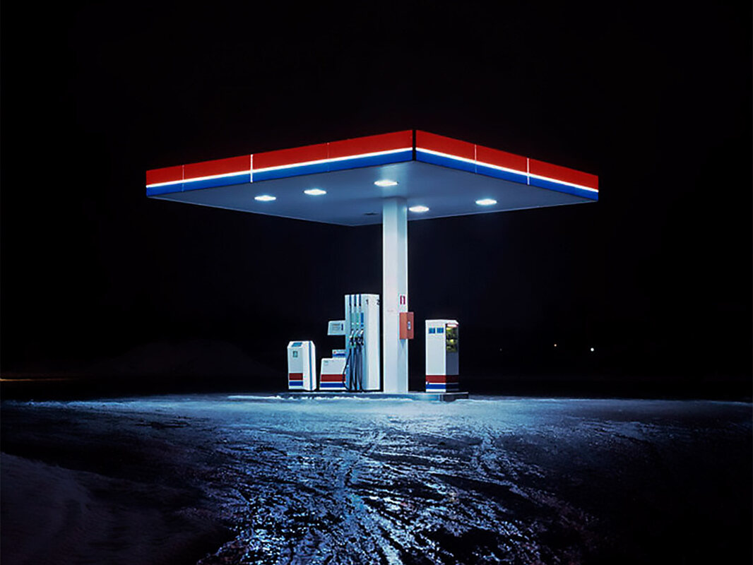
Cold Stations IV by Matt Barnes
|
Photographers Intensions
Matt Barnes intended the viewer to consider what it was like to work and live in isolated areas of the world.
He did this by taking pictures of petrol stations when they where at there quietest.
He wanted us to feel like we where working there and the sense of loneliness that might come with it.
Wider issues
Matt Barnes is considering why some man made areas continue to look the same even though none is looking.
This is shown by the fact that the petrol stations are still illuminated, even though it feels like nobody has used them for hours.
He wanted to explore the atmosphere around a man made building when nobody is there to see it.
Elements, Materials and Techniques
Matt Barnes used a 35mm film camera and Fuji T64 film because this film is very good for rendering light from tungsten and fluorescent light bulbs.
The T64 film creates a blue effect.
The blue cast makes the photos feel colder and uninviting and more like they are in a unpopulated place.
Tokihiro Sato
Analysis
Tokihiro Sato is a Japanese photographer known for his unusual expressions of light and space. He originally a trained sculptor, but decided use photography to communicate his ideas. Sato uses a large format camera and long exposures up to three hours. During the exposure he moves around the composition creating illuminated lines drawn with a torch.
Tokihiro Sato is a Japanese photographer known for his unusual expressions of light and space. He originally a trained sculptor, but decided use photography to communicate his ideas. Sato uses a large format camera and long exposures up to three hours. During the exposure he moves around the composition creating illuminated lines drawn with a torch.
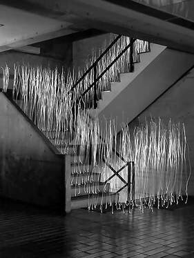
Photo Respiration City Scape 22 by Tokihiro Sato
|
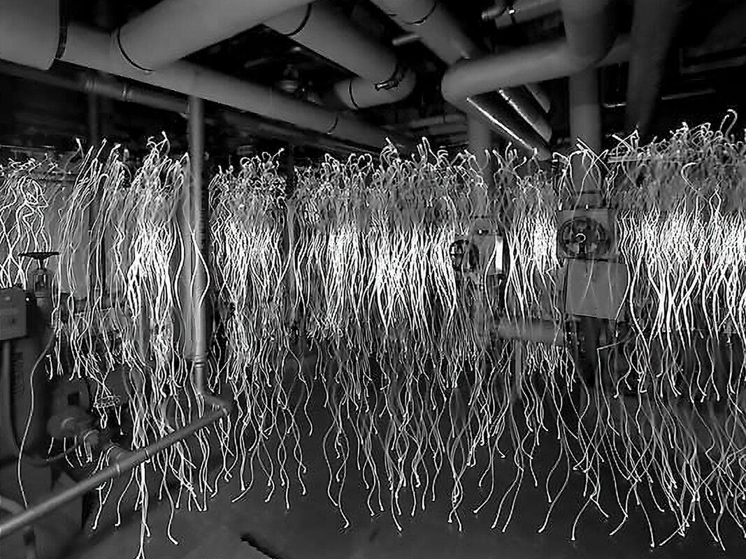
Photo Respiration City Scape 1 by Tokihiro Sato
|
Photographers Intensions
Tokihiro Sato intended to explore ideas about things being temporary.
He did this by photographing points of light that where only there during the exposure.
He wanted us to think about his movements through space within the composition.
Wider Issues
Tokihiro Sato want to express how our lives are temporary and what we leave behind ones we are gone.
This is shown by the light trails in the photos only being visible for the length of the exposure. If you were to visit the location now, there would be no sign of his activity.
Tokihiro Sato explores themes of light, time, space, body and life.
Elements, Materials and Techniques
Tokihiro Sato uses film cameras and vey long exposures during which he moves around the composition painting light trails with a torch.
This creates a star trail effect of where he has been.
This helps supports his point about things being temporary because the light was only there during the exposure.
My Favourite
Tokihiro Sato is my favourite of the three photographers because his process means he needs to physically provide the important elements of his work by using the light and his own movement. It seems like he had more fun setting up his shots because he has to experiment with his own movement. Eliot Porter's and Mark Barnes's work are more traditional and don't feel like they had as much fun making them.
Tokihiro Sato is my favourite of the three photographers because his process means he needs to physically provide the important elements of his work by using the light and his own movement. It seems like he had more fun setting up his shots because he has to experiment with his own movement. Eliot Porter's and Mark Barnes's work are more traditional and don't feel like they had as much fun making them.
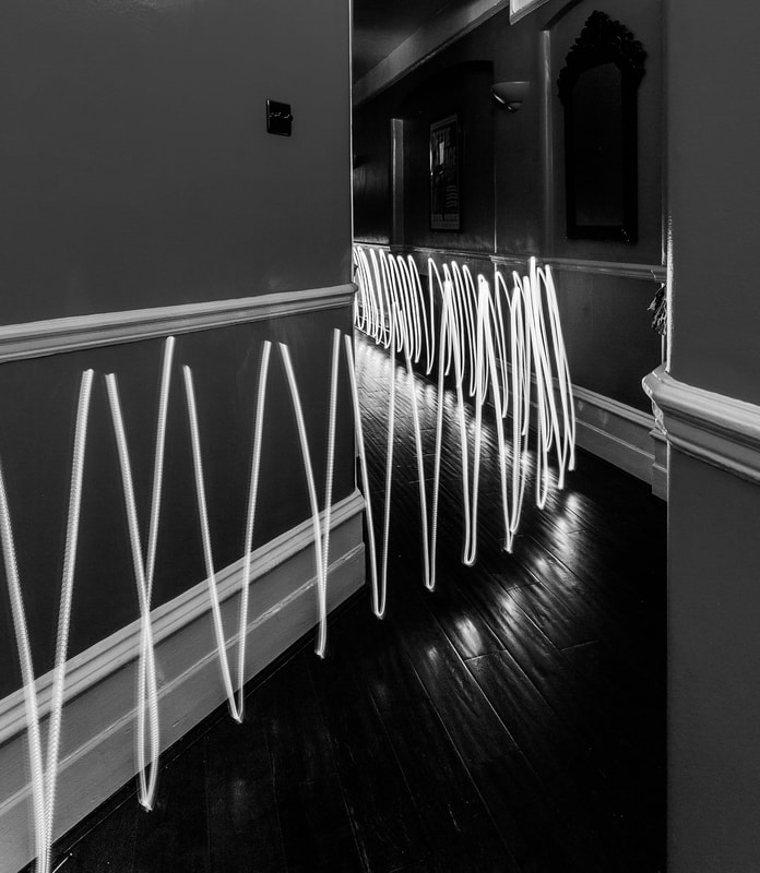
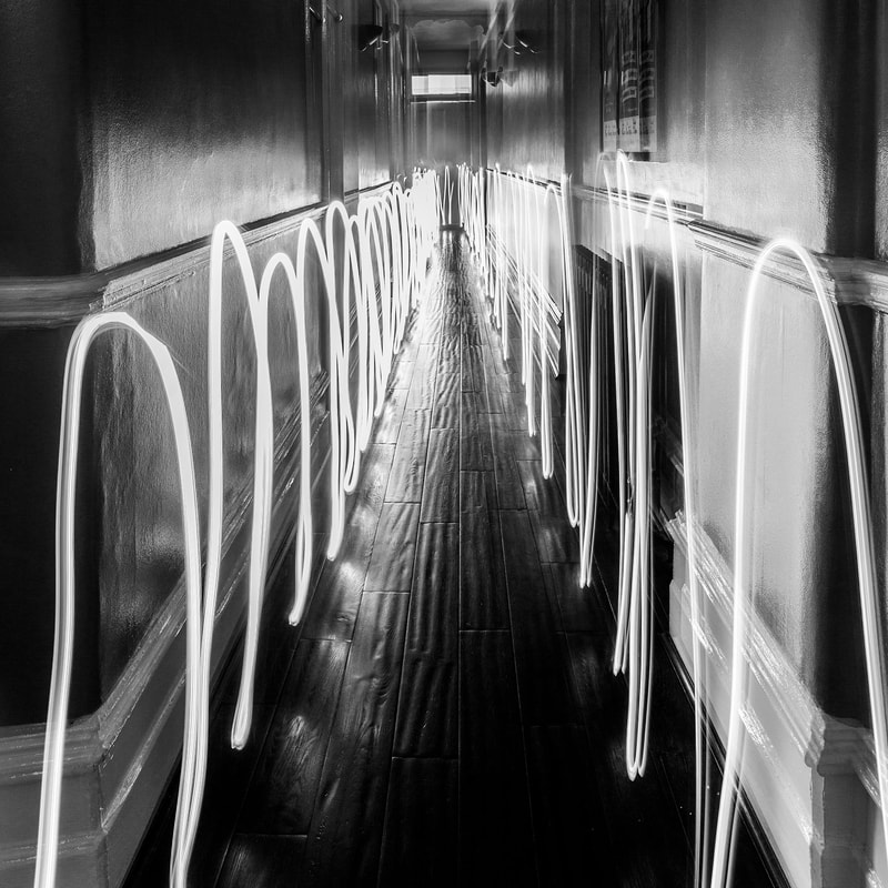
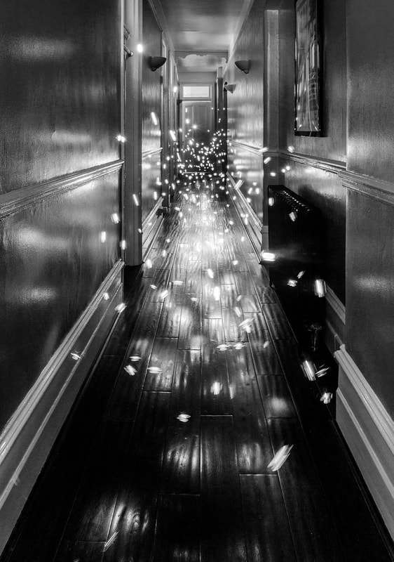
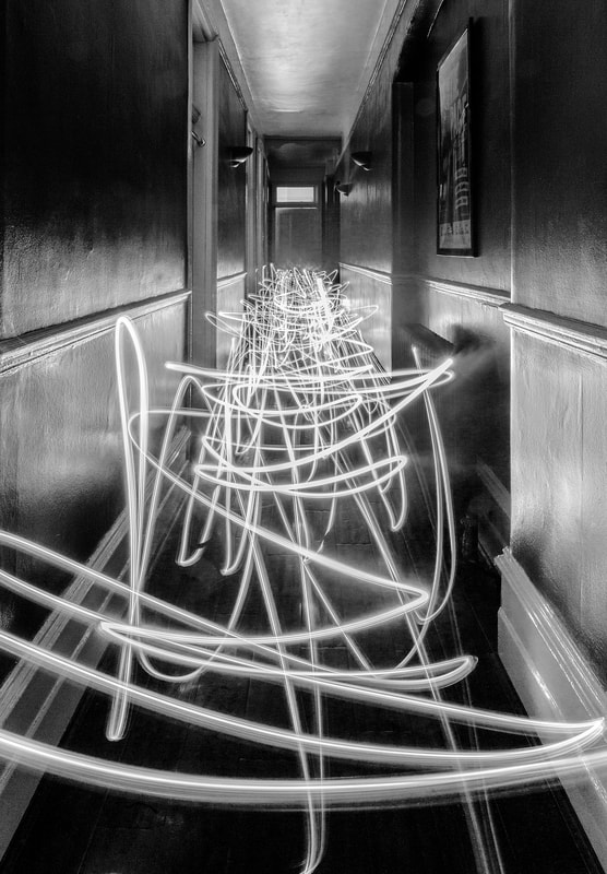
Further Development - Tokihiro Sato
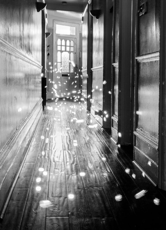
My Response
I made a set of photos in the style of Tokihiro Sato. I took the photos in the hallway of my home during the day. I closed all the doors and blinds to make it dark so I could make long exposures. I borrowed and tripod and a neutral density filter to use with my camera. The neutral density filter is a piece of dark glass that is attached to the front of the lens. It means that I had to use a very long exposure because the filter stops so much light into the camera. Even though I like how the photos look in colour, I used Photoshop to turn my favourite ones into black and white so they are more like Tokihiro Sato's.
I made a set of photos in the style of Tokihiro Sato. I took the photos in the hallway of my home during the day. I closed all the doors and blinds to make it dark so I could make long exposures. I borrowed and tripod and a neutral density filter to use with my camera. The neutral density filter is a piece of dark glass that is attached to the front of the lens. It means that I had to use a very long exposure because the filter stops so much light into the camera. Even though I like how the photos look in colour, I used Photoshop to turn my favourite ones into black and white so they are more like Tokihiro Sato's.
How I Did It
The filter allowed me to set the exposure time to between 30 seconds and 2 minutes. I then moved across the frame while waving the torch. Although I like how the photos look in colour, I used Photoshop to turn my favourite ones into black and white so they are more like Tokihiro Sato's.
What Went Well
I thought my reaction photos worked well because they look similar to Tokihiro Sato's photos., especially after I converted them to black and white. The bicycle headlamp had two settings, on and flashing. Using both settings gave different interesting effects. I also used a neutral density filter for the first time and understood how it can be used to create long exposures.
Even Better If
I think I could have taken the photos at different location other than my home. Tokihiro Sato's photos are made in a range of environments including outdoors. I also could have changed the view of the composition by trying both high and low angles with the tripod. I could have also taken the pictures using different coloured lights and left the final photos in colour.
Top Five
Below are my five best images from the project.
Development
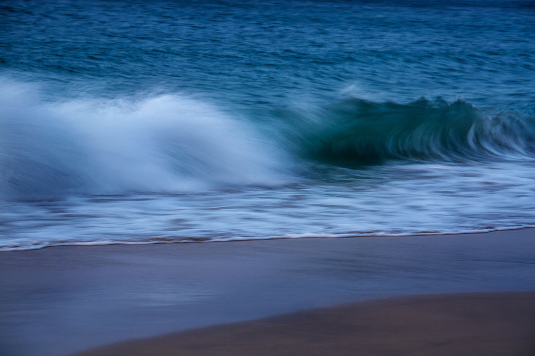
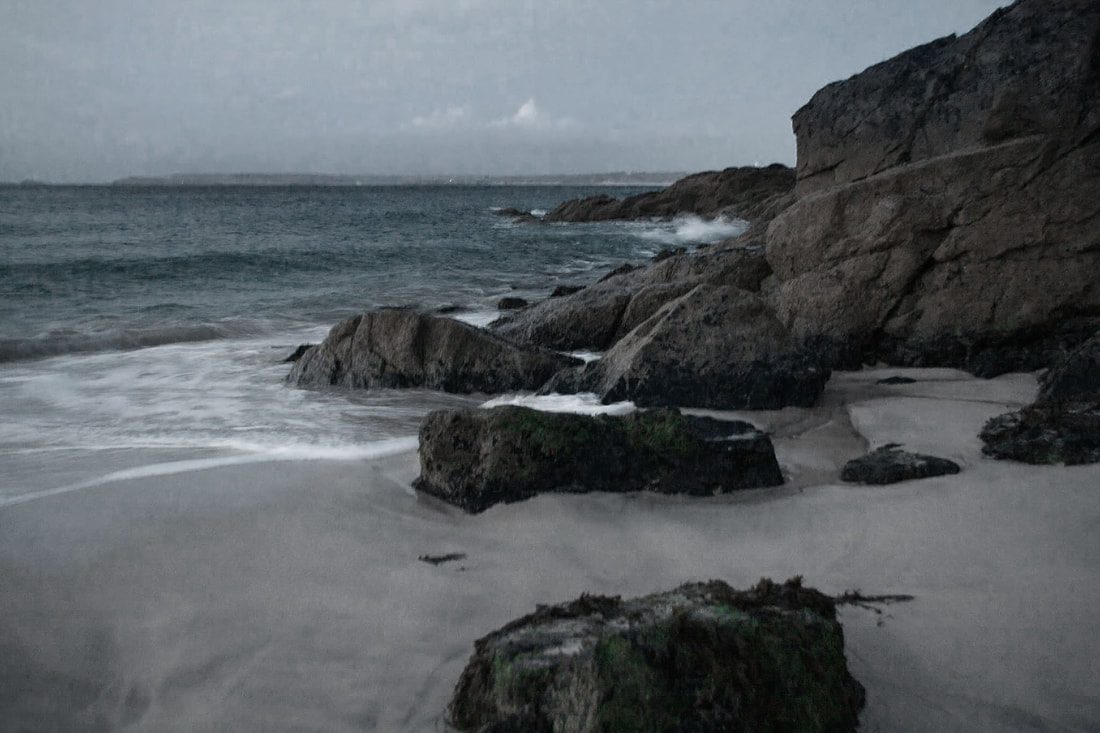
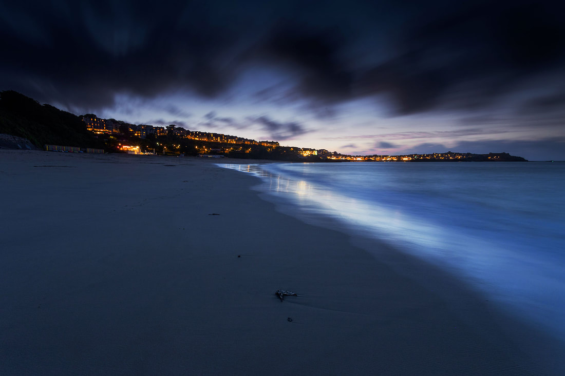
Beach Sunset
I went to the beach in Cornwall to take some pictures of the sunset and to take some landscape photos. I used my DSLR camera with a zoom lens. At first I tried to take the pictures while holding the camera. The pictures looked ok on the back of the camera but when I got home I realised they were too blurry. The last pictures I took on the beach were done using a tripod. I had to use a long exposure but using the tripod meant the photos came out much better.
What Went Well
The first thing I thought that went well was the location. I haven't photographed on a beach before and it was very nice to be there. The waves and the rock shapes looked really nice and I especially like the colour of the sea. The first few photos show the movement of the waves crashing and the power of the sea. The pictures I took using the tripod came out sharp and the long exposure was the same method I used with the Tokihiro Sato light painting photos.
Even Better If
When I got to the beach it was already getting dark. The pictures I took without the tripod are blurry because I couldn't hold the camera still for long enough. If I had got there an hour earlier it would have still been light enough to hold the camera and get sharp photos. It wasn't possible to get there earlier so I should have used the tripod for all of the pictures.
Top Three
Below are my three best images edited in Photoshop.
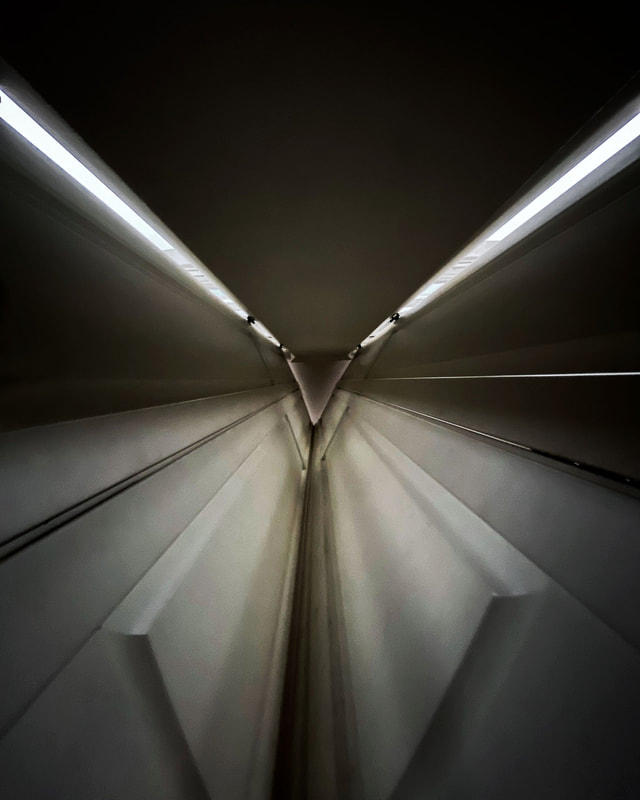
Home Details
I did a photoshoot at home where I captured details of different rooms. I tried to make the things I photographed look a bit different from what they actually are by photographing them close up. I also tried different angles to try and make them more interesting. I used strong shapes and lines to make the final photos simple. The slide show of the photos I took is below.
What Went Well
I thought pictures are a nice selection of shapes and colours. There are a few compositions where it is quite difficult to make out what it is that I photographed which is what I had hoped for. I especially like the zig zag diagonal lines where I was playing with camera angles. Some of the pictures were taken while I was lying on the floor and I think this helped me use my imagination more when finding compositions.
Even Better If
I used a phone to take the pictures. If I had a camera with a lens to allow me to take the photos really close up it would have been better. I had difficulty focusing the phone lens very close up. I also think most of the photos are very easy to see what it is. I hoped that they would have been more abstract. I think if I had turned the pictures to black a white they may have been more interesting.
Top Three
Below are my three best images from the project edited in Photoshop.
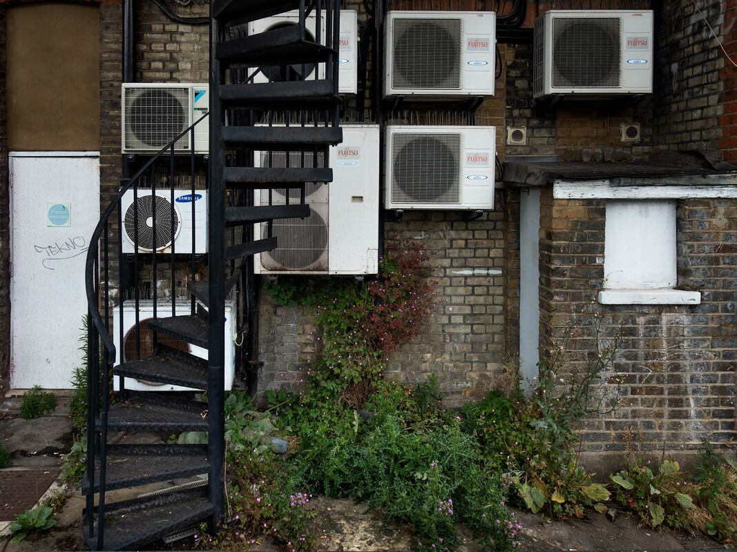
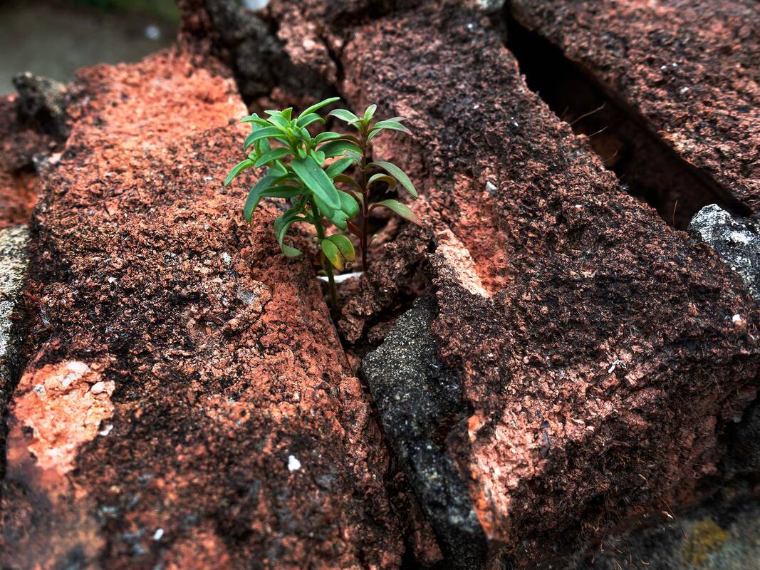
Close Up and Far Away
I went for a walk in close to where I live to photograph both close up and far away pictures of the same scene. The pictures are all taken less than a hundred metres from home. I used a 18-125mm lens on my DSLR camera. This meant I could take two pictures of each scene without changing position. I have six pairs of images which are shown below.


What Went Well
I thought the pairs of pictures work well together. The close up shots are interesting because they are detail and abstract.
The wide angle photographs work well because they show the area of the close up photos and their surroundings. Using the 18-125mm lens meant that I could take the two photos in each pair without moving position.
Even Better If
Too many of my pictures include a plant or tree as the close shot. It would have been better if I had more variation in the pictures, especially the close up photos.
Final Piece
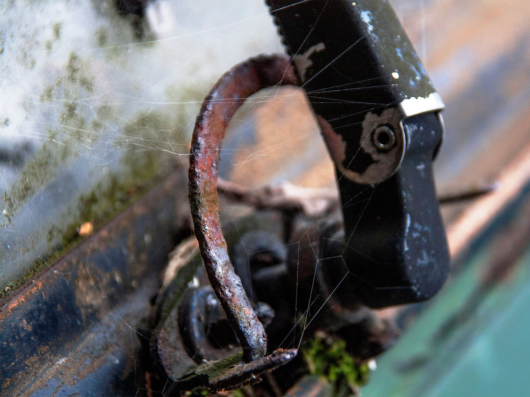
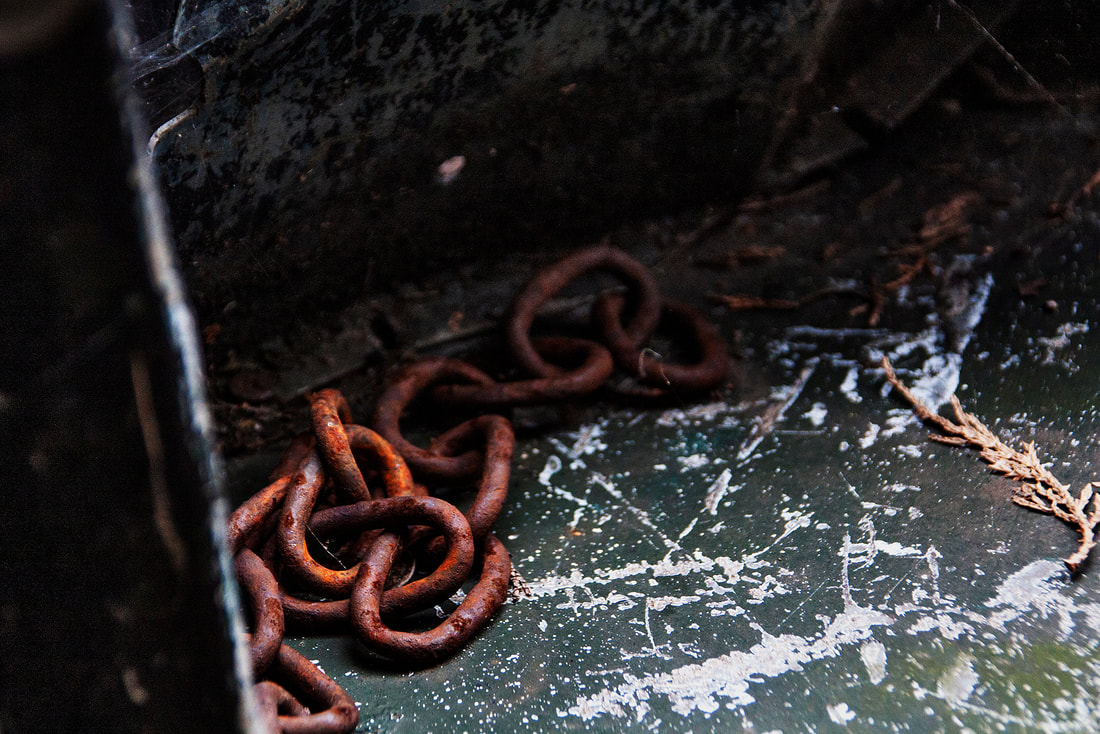
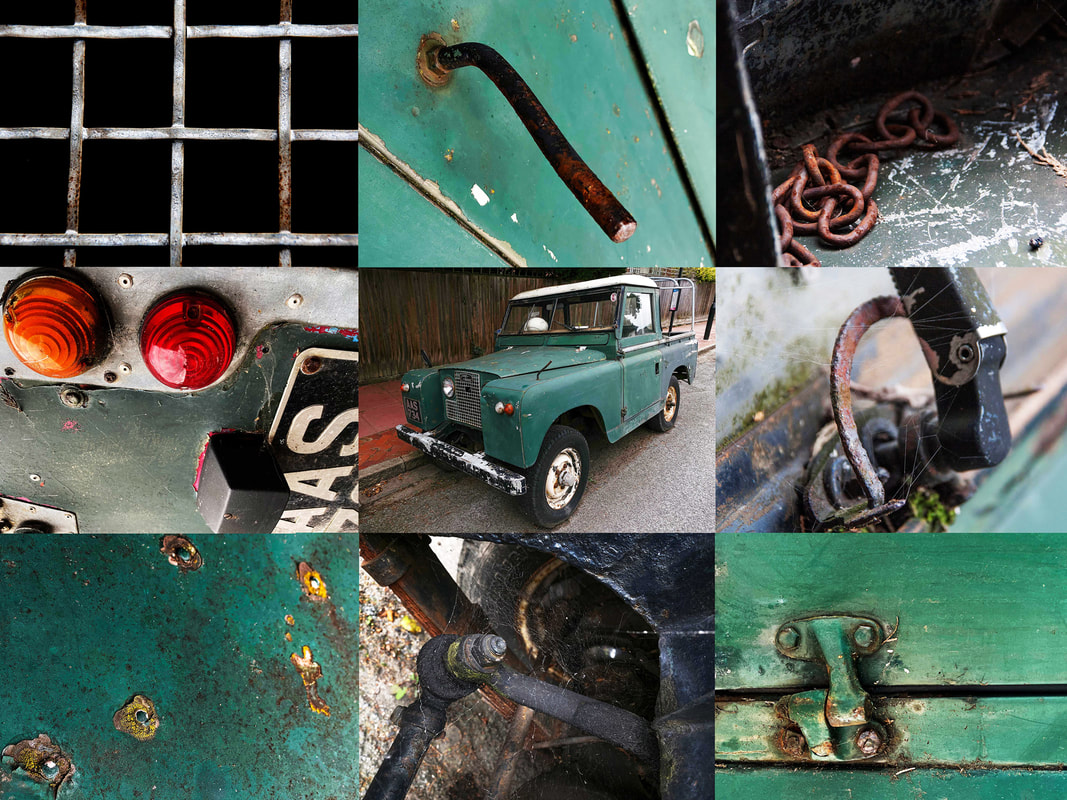
Land Rover Details
I made a set of images of an old Land Rover that is parked near my home. I tried to make them in the same style as the home details photos. I used my DSLR and phone to take the pictures. I photographed the car from every side and took some picture through the window. I spent a long time trying to get nice abstract pictures.
What Went Well
| managed to get a lot of photos by just looking around the car. I was surprised I managed take this many in such a small area. I think there is a nice variety of pictures of the inside, outside and underneath the car. The car is very old, dirty and rusty which made it more interesting to photograph. If it was a new clean car it wouldn't have been as good.
Even Better If
The photos are all taken at the same distance from the car. I think it would have been better if I had taken some of the pictures further away and used a variety of vocal lengths.
Top Three
Below are my three best images.
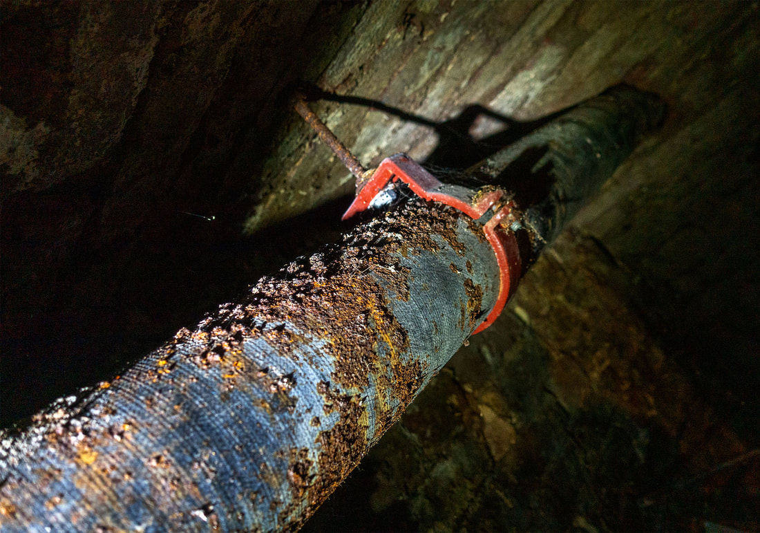
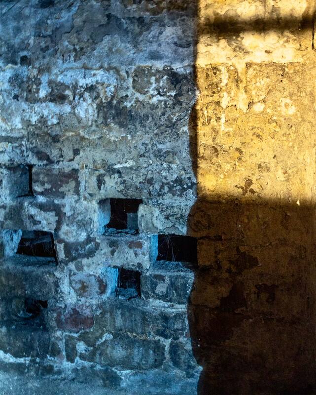
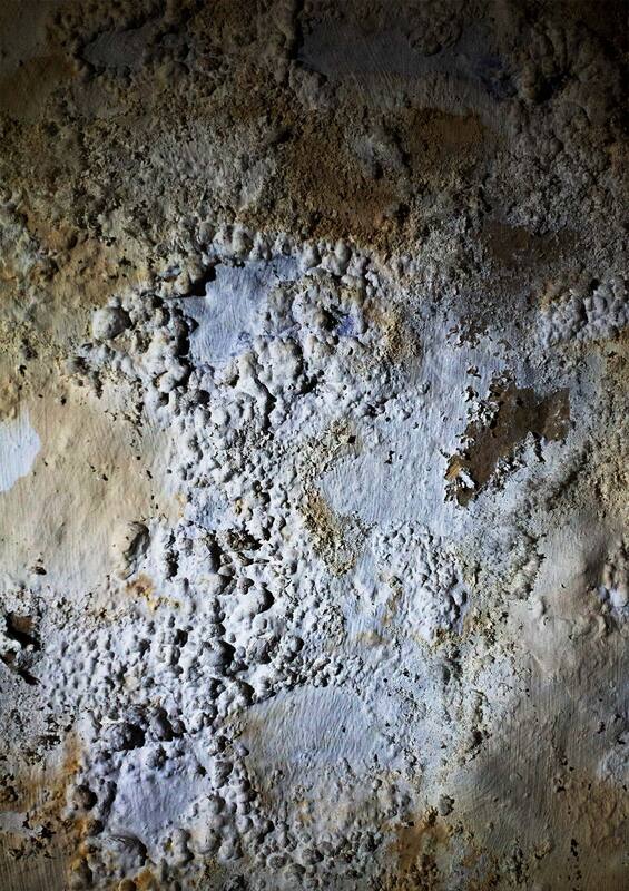
Derelict Basement
I made a set of images of a run down basement under a shop. I also took some pictures of the back yard which was overgrown. Most of the pictures are close up detail shots. I also took some wider picture from the basement to show the area.
What Went Well
I took a lot of pictures in a very small space. Even though I thought there wasn't going to be much to take pictures of, I found there was plenty to do once I looked harder. I used a torch to light some of the photos. I held the torch out to one side to make strong shadows.
Even Better if
I took a lot of photos in a short amount of time and most of them were rushed. I could have improved them by taking my time and getting the shots perfect. The location was very dark so I has to use a wide aperture. I should have used a tripod to steady the shots so I would have had less blurry images. I think that the wide pictures are not wide enough. This is because the room was very small so I couldn't stand far back. If I had a wider lens I could have fitted more in.
Top Five
Below are my five best images.

Development Project Summary
What Went Well
I thought that all of the projects were interesting. I like how all of the projects look very different to each other. The beach photos were made with a wide angle lens and it's obvious what the pictures are of. The pictures of the basement and the Land Rover were made close to the subject. It's difficult to tell what is being photographed if you just look at one photo. I learned during these projects that a set of abstract photos can be used together to build up a bigger picture and feeling of the subject.
Even Better If
I think that I got better at finding interesting details and compositions with each project. I think that if I slowed down a bit more I could have found better shapes to include in the pictures. Also each set of picture were taken in similar flat light. If I had revisited the locations at different times of day I may have had better light. Some of the close up pictures have areas out of focus which looks good in some photos and bad in some of the others. I could experiment with different apertures next time to see if it improves the pictures.
Final Development Project
Introduction
For my final Environment project I wanted to use the same technique I used for the Land Rover photos. This is because I enjoyed exploring the rusty broken car and tasking a series of pictures that when seen together they tell a bigger story. I also like how when the pictures of the Land Rover are placed in a grid with the car in the middle it makes sense.
For my final Environment project I wanted to use the same technique I used for the Land Rover photos. This is because I enjoyed exploring the rusty broken car and tasking a series of pictures that when seen together they tell a bigger story. I also like how when the pictures of the Land Rover are placed in a grid with the car in the middle it makes sense.
My Response
I first needed to find something run down that would be big enough to allow me to take enough interesting photos. I explored the grounds of my school and Blanche Neville school and found an old shed. It looks like it is about to fall down and has lots of rusty or broken parts. I took a series of close up photos of the shed and one wide one showing the whole building. Below is a slide show of the pictures.
The grid has nine photos with the wide photo in the middle. I selected eight of the most interesting photos and arranged them in the grid around the wide angle photo in the middle. The final image is shown below.
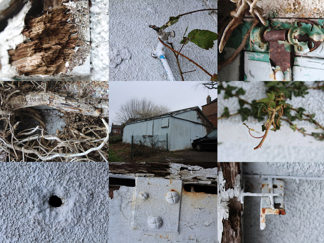
What Went Well
The building I chose gave me lots of options to find close up photos. I like that I was able to do this project at school and that it shows that a boring old building can be made to look interesting if you look hard enough.
Even Better If
I would have liked to shoot the building on a sunny day because I think that there would have been a lot of interesting shadows to experiment with.
