Stuart Haygarth
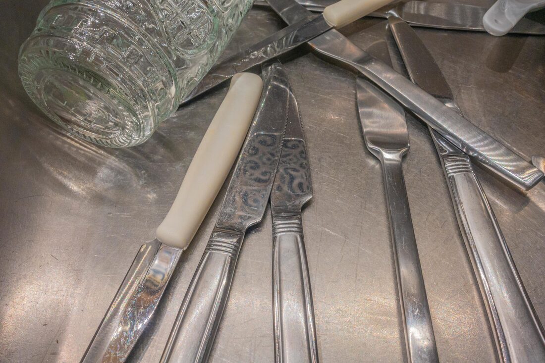
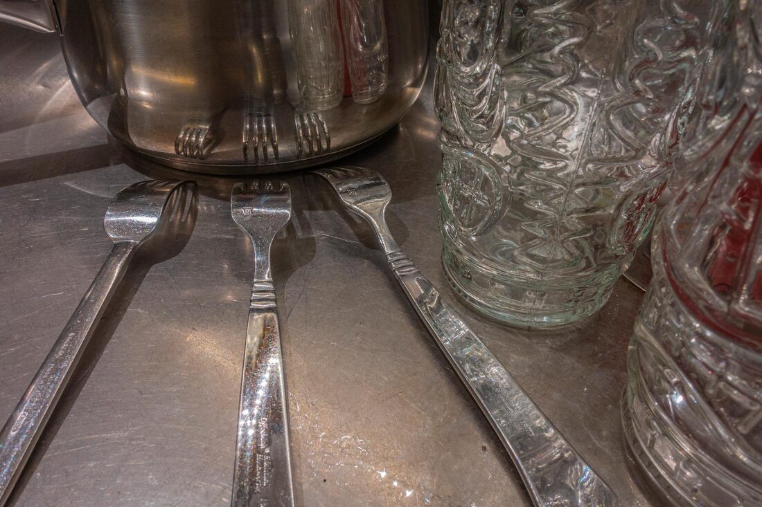
 Collection (yellow) by Stuart Haygarth
Analysis
Stuart Haygarth creates single colour or two colour surreal two dimensional photographs. He does this by using discarded man-made objects he finds along the southern coast of England. His work urges the viewer to consider the reckless pollution of the earth. Stuart Haygarth illustrates the scale of pollution in the sea and its effect on the health of the planet. This is shown by the wide range of debris featured in his work. Stuart Haygarth became interested in this issue because he saw how man’s reckless treatment of the environment was effecting the area he lived in. After collecting a lot of debris Stuart Haygarth separates it out into groups of colours. He arranged and photographed the items on a white background which helps separate the individual shapes. This helps to support Stuart Haygarth’s point about how we are all responsible for looking after the environment as we can see that most of the debris is from family households and not industrial pollution.
My Response
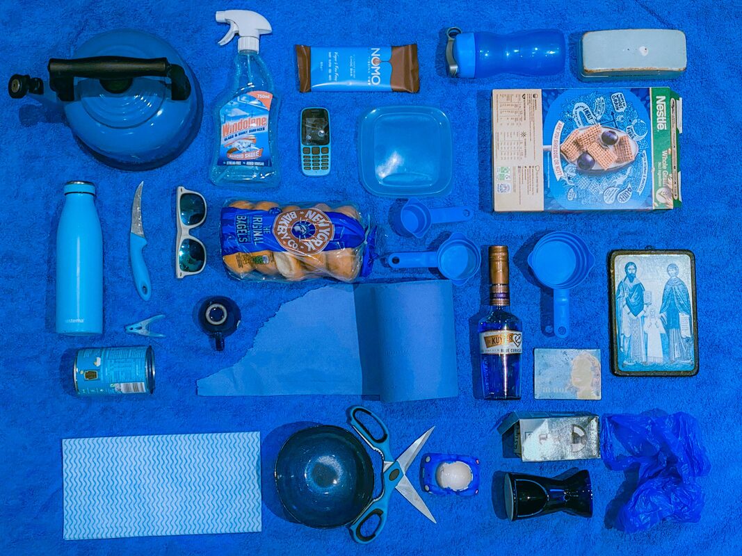
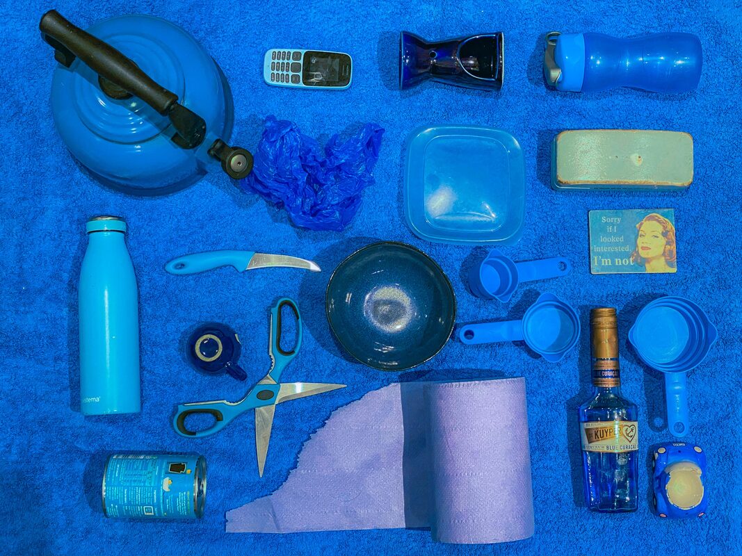
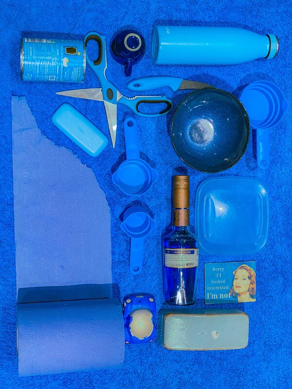
I made a series of images in the style of Stuart Haygarth’s Categories work. For this I used a selection of blue items all found in my kitchen. I also made some photos using sport and fitness equipment I have at home.
Stuart Haygarth creates single colour or two colour surreal two dimensional photographs. He does this by using discarded man-made objects he finds along the southern coast of England. His work urges the viewer to consider the reckless pollution of the earth. Stuart Haygarth illustrates the scale of pollution in the sea and its effect on the health of the planet. This is shown by the wide range of debris featured in his work. Stuart Haygarth became interested in this issue because he saw how man’s reckless treatment of the environment was effecting the area he lived in. After collecting a lot of debris Stuart Haygarth separates it out into groups of colours. He arranged and photographed the items on a white background which helps separate the individual shapes. This helps to support Stuart Haygarth’s point about how we are all responsible for looking after the environment as we can see that most of the debris is from family households and not industrial pollution.
My Response
I made a series of images in the style of Stuart Haygarth’s Categories work. For this I used a selection of blue items all found in my kitchen. I also made some photos using sport and fitness equipment I have at home.
What Went Well
The blue photos using the kitchen items look better than the photos using the sports equipment. I think this is because they look more like Stuart Haygarth’s work.
Even Better If
I think I could have been more careful to avoid getting my shadow in the photos. I also think that I could have stood more directly over the items. The worst photos are the ones where the borders are not parallel.
Top Three
Below are my three best images from the project.
Jan Groover
 Untitled (1979) by
Jan Groover
Untitled (1979) by
Jan Groover
Analysis
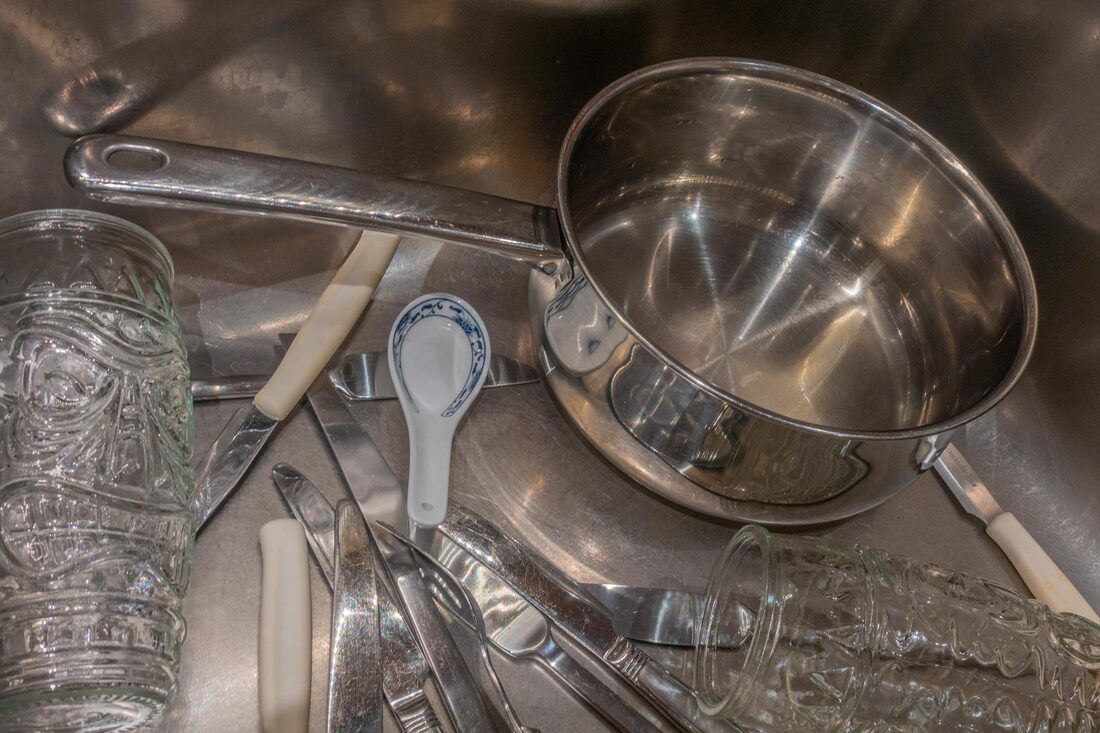
Jan Groover created intimate still life images using objects she found in and around her home. She did this by collecting ordinary items and arranging them in a way that seems chaotic at first, but the placement of the items were actually carefully considered. Jan Groover’s compositions were about space and how things relate to each other. Jan Groover used her photography to express her dislike for deep political conservatism in the United States. Her dramatic still-life photographs of objects in her kitchen sink caused a sensation as they showed that a working class artist can produce fine art using items everybody has access to. Jan Groover was interested in this issue after growing up in New York and spending most of her time indoors. Jan Groover used large format cameras and traditional dark room techniques to create her work. The the photographs are made close to the subject creating an almost abstract effect. On closer inspection it can be seen that the items may have been placed in a way that they seem to be interacting with each other. This helps to support Jan Groover’s point about space and how things relate to each other.
My Response
I made a series of images in the style of Jan Groover’s Kitchen Utensils work. For this I used a selection of my own family’s utensils and photographed them in the kitchen sink.
What Went Well
The photographs produced some interesting reflections, shapes and patterns.
Even Better If
Some of the photographs are blurred because the shutter speed was too long. If I had taken the photos using brighter lights I could have used a shorter exposure and the photos would not have been blurry. Also I should have taken more care to hide the reflection of the camera in the shiny objects.
Top Three
Below are my three best images from the project.
Andre Kertez
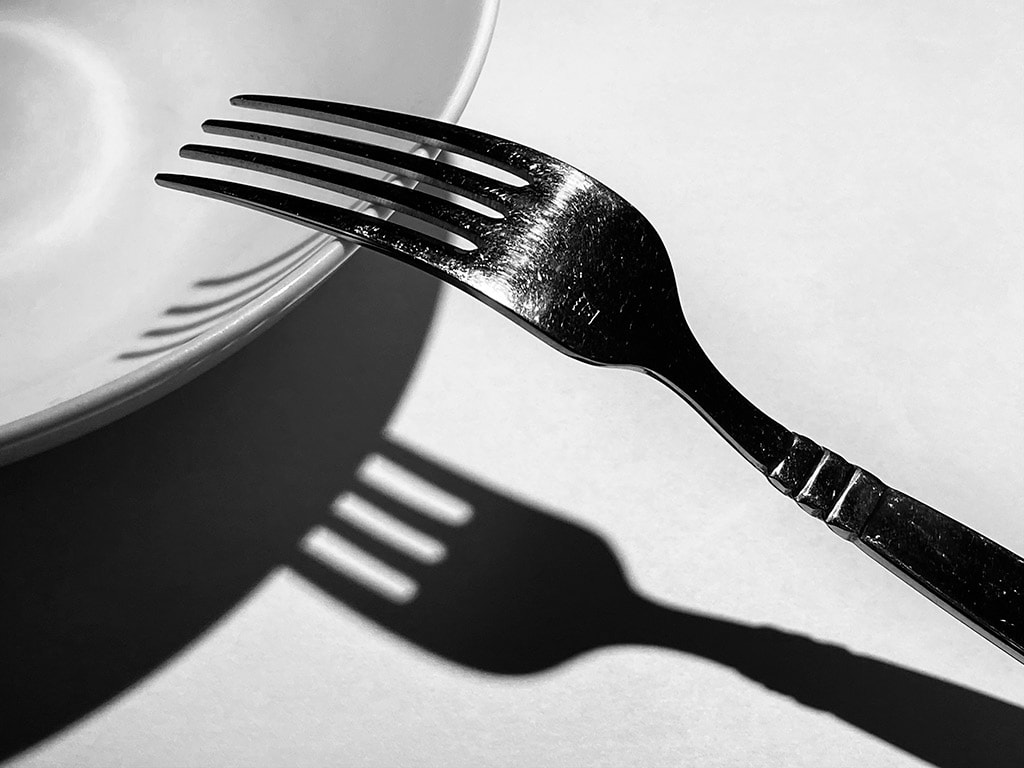
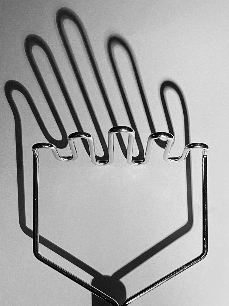
 La Fourchette by Andre Kertez
Analysis
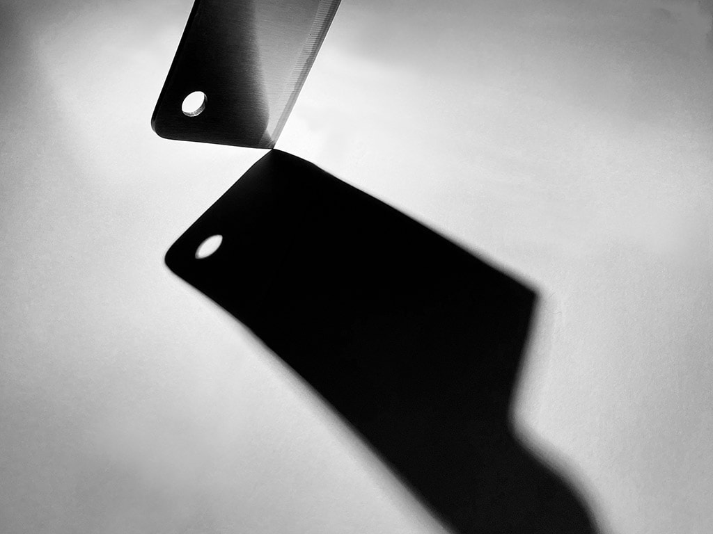
Andre Kertez was a Hungarian photographer famous for his studies on composition and work in photojournalism. While living in Paris he made a picture of a fork. It is a very simple photograph of a fork resting on a bowl. The strong light is casting a black shadow on the table. The shape the shadow is making is as important to the composition as the fork. The picture is considered as masterpiece of composition.
My Response
I made a series of images on my phone using items from our kitchen and a torch to make strong shadows. I used the stainless steel work top as a background to begin with but thought the pictures looked better on white paper. If first tried to copy the original picture before trying some of my own ideas. I converted the pictures to black and white using Photoshop.
Here is a slideshow of the pictures I took before I edited them.
What Went Well
Using the bright light from the torch was a good idea. The shadows were very strong and made interesting shapes. The shadows were very long and I composed the pictures so they are as important at the items being photographed.
Even Better If
The white paper stopped the light reflecting off the steel table. It would have been better if I had used one single large piece of paper instead of overlapping four sheets. I think the picture of the fork similar to Kertez's picture is the best. I think this is because the shadow and the fork are separated. In most of my pictures the object and the shadows overlap. The pictures would have been better if I have tried to separate them. My other two best pictures are ones that have the simplest shapes.
Top Three
Below are my three best images from the project.
Robert Holden
Analysis
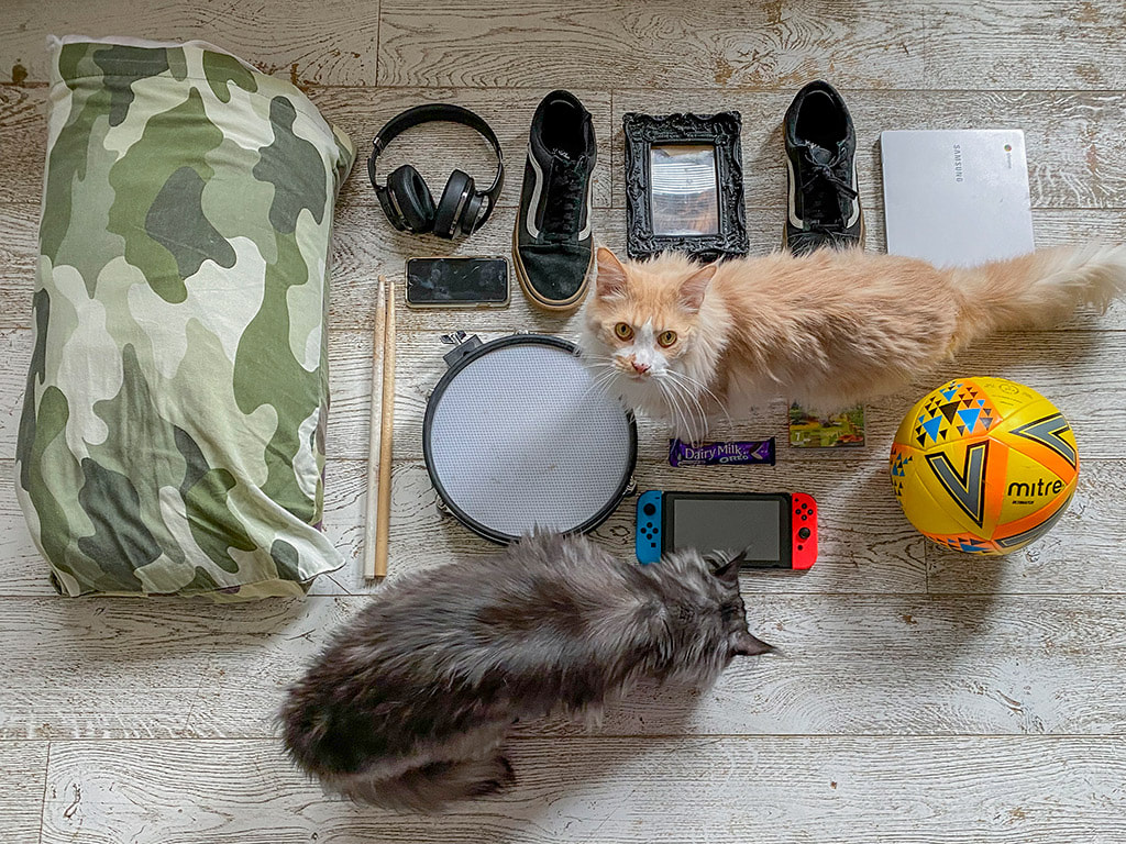
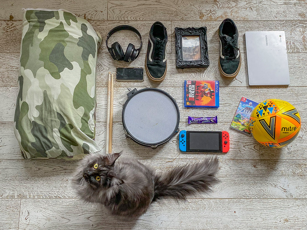
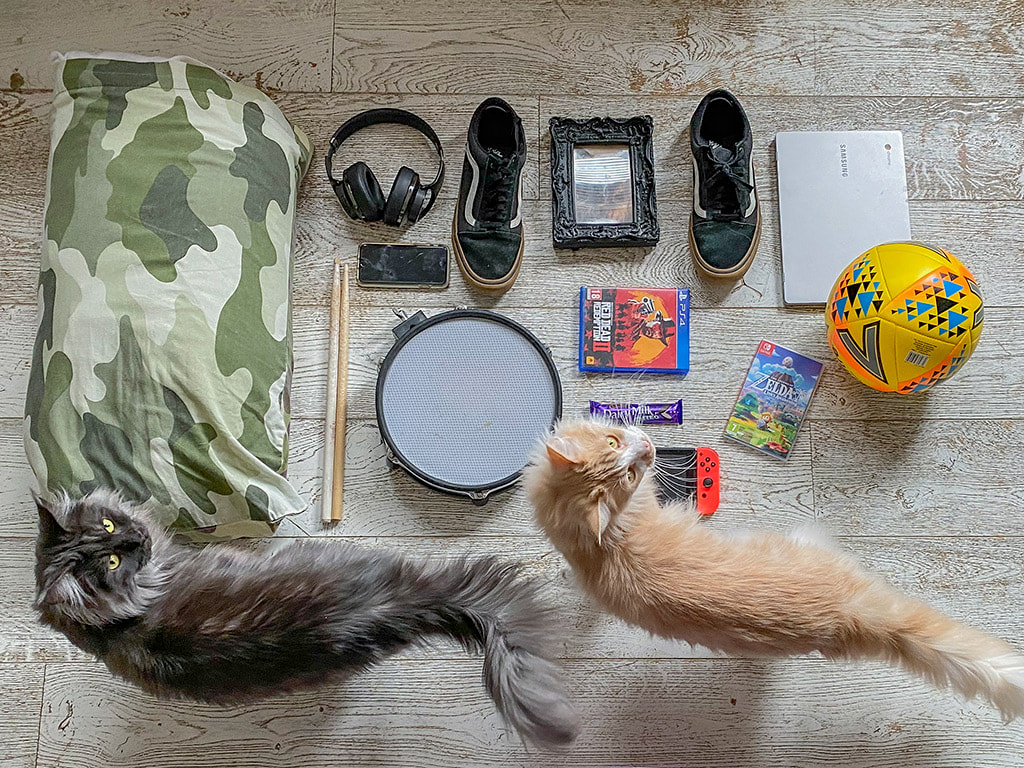
Robert Holden is an American photographer and environmentalist. Many of his projects are personal and based on his own experiences. Robert Holden took a picture his favourite things that he would rescue if his house was burning down. This started the Burning House project where people capture their interests by photographing a few items. Below are some pictures from the Burning House project.
Robert Holden is an American photographer and environmentalist. Many of his projects are personal and based on his own experiences. Robert Holden took a picture his favourite things that he would rescue if his house was burning down. This started the Burning House project where people capture their interests by photographing a few items. Below are some pictures from the Burning House project.


My Response
I made a series of pictures that would fit in with the Burning House project. I found items and animals that are very important to me and tried to arrange them so each item could be seen clearly.
I made a series of pictures that would fit in with the Burning House project. I found items and animals that are very important to me and tried to arrange them so each item could be seen clearly.
What Went Well
The items I chose are clearly separated. This makes it easy to see what each thing is. I used my Dad to help me arrange the items while I looked through the camera. He was also able to position the cats, which I would not have been able to do.
Even Better If
The pictures would better if I have chosen a different surface. I don't like the wooden floor. I should have been more careful to keep my reflection out of the shiny surfaces on some of the items. I think I should have either zoomed in or held the camera closer because I had to crop the photos quite a lot to make my top three.
Top Three
Below are my three best images from the project.
Luke Stephenson
|
Analysis
Luke Stephenson is from Darlington, England. His photography is often a funny look at life in England. He creates portraits of strange subjects including birds, ice creams and roses. Stephenson made a project from photographing every Corn Flake in a box. There were 7122 cornflakes in total. He photographed each one from the same angle on a black background. At the end he then made a short film of each photograph and set it to music. |
|
My Response
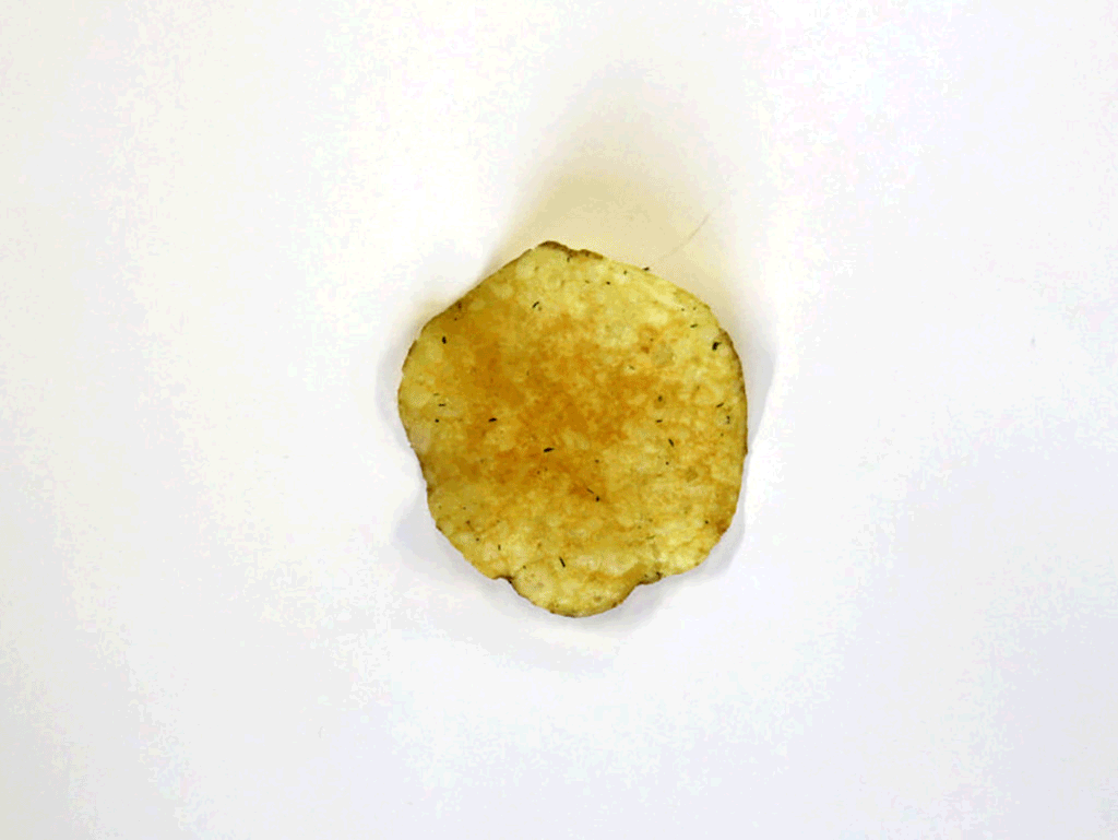
I made a series of images in the style of Luke Stephenson’s Corn Flakes project. I didn't have any Corn Flakes so I photographed a bag of crisps instead.
I made a series of images in the style of Luke Stephenson’s Corn Flakes project. I didn't have any Corn Flakes so I photographed a bag of crisps instead.
What Went Well
Even though I only photographed 20 crisps, the shapes were all quite different and random. This is similar to the Corn Flakes photos and makes the animation more interesting.
Even Better If
I think I should have used a black background to make the crisps stand out more. Even though I used a camera on manual mode, some of the pictures are darker than others. This is because the light coming into the room was changing as the weather outside was also changing. I could have made every picture look the same if I had closed the blinds and used artificial light from a light bulb or the flash on the camera.
Top Three and GIF
Below are my three best images. I chose them because they are all very different shapes. I also made a GIF using the photos.


Edward Weston
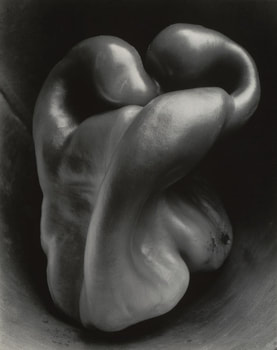 Pepper No. 30 by Edward Weston
Analysis
Edward Weston was one of the most innovative and influential American photographers of all time. For over 40 years he photographed a range of subjects including landscapes, still lives and portraits. Many of his photographs were made using a large view camera and slide film. In 1930 Weston began taking close-ups of vegetables and fruit. The most famous of these is a series of photos of peppers. The pictures are examples of how simple objects can be made to look beautiful by using their shape and the right light. If the the peppers were lit from a different angle the pictures would look boring. I also like how they look like twisted human or animal shapes.
Edward Weston was one of the most innovative and influential American photographers of all time. For over 40 years he photographed a range of subjects including landscapes, still lives and portraits. Many of his photographs were made using a large view camera and slide film. In 1930 Weston began taking close-ups of vegetables and fruit. The most famous of these is a series of photos of peppers. The pictures are examples of how simple objects can be made to look beautiful by using their shape and the right light. If the the peppers were lit from a different angle the pictures would look boring. I also like how they look like twisted human or animal shapes.
My Response
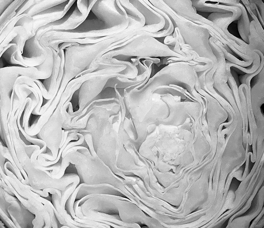
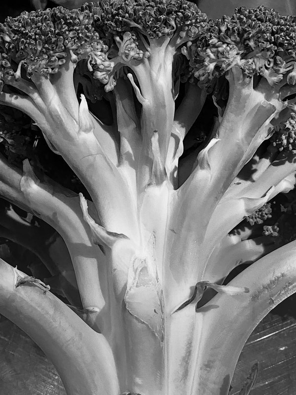
I made a series of pictures using fruit and vegetables found in our kitchen at home. I used a torch to light the objects from the side or above. This was to try and make strong shadows and more interesting shapes. I then converted the photos to black and white because Edward Weston's work was also in black and white.
I made a series of pictures using fruit and vegetables found in our kitchen at home. I used a torch to light the objects from the side or above. This was to try and make strong shadows and more interesting shapes. I then converted the photos to black and white because Edward Weston's work was also in black and white.
What Went Well
I think that most of the pictures look good because of the shapes made by the vegetables and the dark shadows. I cropped the photos to get rid of messy parts of the pictures or parts of them that were not needed. The best pictures were the ones with the most simple shapes.
Even Better If
The set of images would have been better if I had tried to find compositions that were as simple as possible. Some of the the pictures look bad because they are very messy. I think I could have chosen cleaner and more simple items to photograph. Edwards Weston's peppers are nice and shiny and reflect the light. Most of the vegetables I photographed are dull, I should have chosen items with shiny surfaces.
Top Three
Below are my three best images from the project.

David Hockney
Analysis
David Hockney is an English painter, designer and photographer. He is considered one of the most influential British artists of the 20th century. David Hockney is connected to the Pop Art movement. This movement was interested in responding to Popular Culture. Hockney created photojoiners that consisted of photographs taken of the same object from different perspectives. The images were then collaged together to recreate the place, person or object even though the overall appearance may look distorted. This work connects with the Cubist movement, one of Hockney's major aims.
Hockney's photojoiners were created using a mixture of Polaroid and 35mm film photographs. The pictures resemble Cubism, pioneered by Pablo Picasso, because the photographs are taken from different perspectives and at sometimes at different times of the day. Even though the separate photos don't mean much by themselves, when they are placed together they create a story as if the person looking at it is moving through the room or scanning the object.
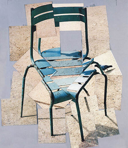
Image of a chair photojoiner by David Hockney
|
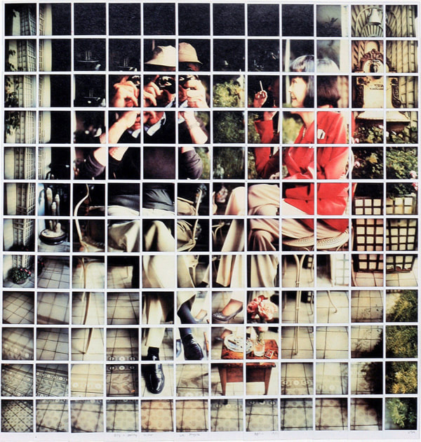
Portrait of man and woman using the photojoiner grid technique
|
My Response
I made three images in the style of David Hockney's photojoiners. The first is of a chair, the second our kitchen and the third is of my brother playing Play Station.
I made three images in the style of David Hockney's photojoiners. The first is of a chair, the second our kitchen and the third is of my brother playing Play Station.

Office chair joiner
What Went Well
The chair works very well in front of the pink wall. The final picture isn't too complicated. There isn't any part of the picture that has holes in where I missed a spot. The picture shown is my second version of this chair. The first one did not work because the pictures would not overlap in Photoshop. This is because I moved around the chair too much instead of staying in one spot and moving the camera angle.
Even Better If
I think that the picture is a bit too simple. I should have taken more photos closer together to make it more interesting. There are only about 12 photos making up the final image.
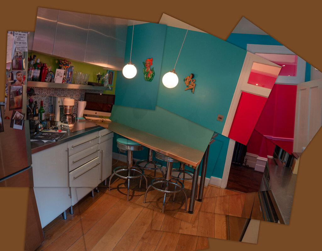
Kitchen joiner
What Went Well
I set the camera on manual mode and did not make any adjustments to the shutter speed or aperture. The photos are exposed slightly differently and the colours are also a bit different on the blue wall. This is because the light outside changed while I was taking the pictures. This helps separate the layers. Also I like the how the picture shows the pink hallway and not just one room.
Even Better If
I think the picture would look nicer if I had tidied up the kitchen and planned how it was going to look. I angled the camera too much on some of the photos and Photoshop could not use them in the collage, so next time I will not turn the camera so far. I also think I could have used a more interesting place to take the pictures from instead of just standing with the camera at head height.

Video game joiner
What Went Well
All of the photos in this picture are sharp, even though the room was quite dark. I had to set the ISO to 640 to let enough light into the camera. I closed the blinds because the sunlight coming in through the window was too bright. I took a lot of photos which meant I had plenty to chose from.
Even Better If
I think the light is a bit boring. I could have adjusted the blinds a little bit for each photo. This would have meant that each photo would have slightly different lighting. I think this would have made the different layers on the final picture stand out from each other.
Chad Pitman
Analysis
Chad Pitman is an American photographer who explores interesting ways of photographing people. In his series With People: In Progress he breaks up the person he's photographing into different areas. He focuses on different sections of a person’s face and body. By taking separate photos the viewer is encouraged to look more closely at the textures, shapes and colours that make up a person.
Chad Pitman is an American photographer who explores interesting ways of photographing people. In his series With People: In Progress he breaks up the person he's photographing into different areas. He focuses on different sections of a person’s face and body. By taking separate photos the viewer is encouraged to look more closely at the textures, shapes and colours that make up a person.
An image from the With People: In Progress project
|
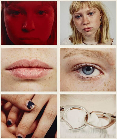
Some of the image use coloured lighting
|
Lauren Marek
Analysis
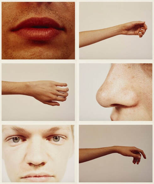
Lauren Marek is another American photographer making images of people by breaking the body onto separate areas. Marek has a project called Pieces. The work focuses even closer to the person than Chad Pitman. The individual photos are abstract but displayed together is a grid. Marek is inspired by Picasso and his cubism. She uses nine images in the grid to create her abstract representations of a person.
Lauren Marek is another American photographer making images of people by breaking the body onto separate areas. Marek has a project called Pieces. The work focuses even closer to the person than Chad Pitman. The individual photos are abstract but displayed together is a grid. Marek is inspired by Picasso and his cubism. She uses nine images in the grid to create her abstract representations of a person.
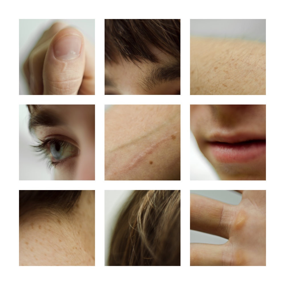
A series of image from Lauren Marek's Pieces
|
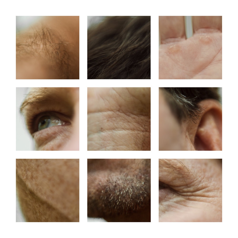
Marek's photos in a grid of nine
|
My Response
I made a series of images in the style of Lauren Marek. Below is a slide show of the photos I took of a classmate.
I made a series of images in the style of Lauren Marek. Below is a slide show of the photos I took of a classmate.
I selected nine of them to make into a grid. I cropped each photo to a square shape just like Marek did. Here is my final image


What Went Well
I used a DSLR camera and I set a large aperture. This gave a shallow depth of field which worked very well to isolate the body part I was photographing and make the rest of the picture blurry. My classmate stood close to the window which made the light on him very nice. This also also meant I could use a fast shutter speed so most of the pictures were sharp.
Even Better If
Even though my final grid of nine looks nice it was hard to do because I didn't have many pictures to chose from. I only shot 12 pictures and some of them are almost the same. I should have photographed more parts of the body and made more pictures of each area.
Development - Steve Purnell
 One of Steve Purnell's images
Analysis
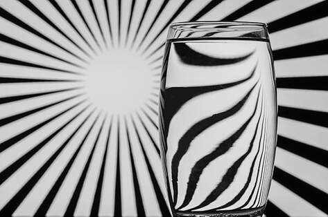
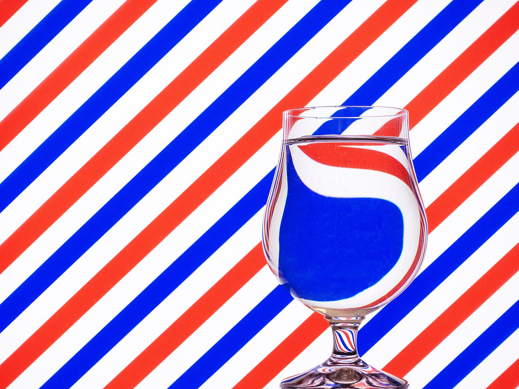
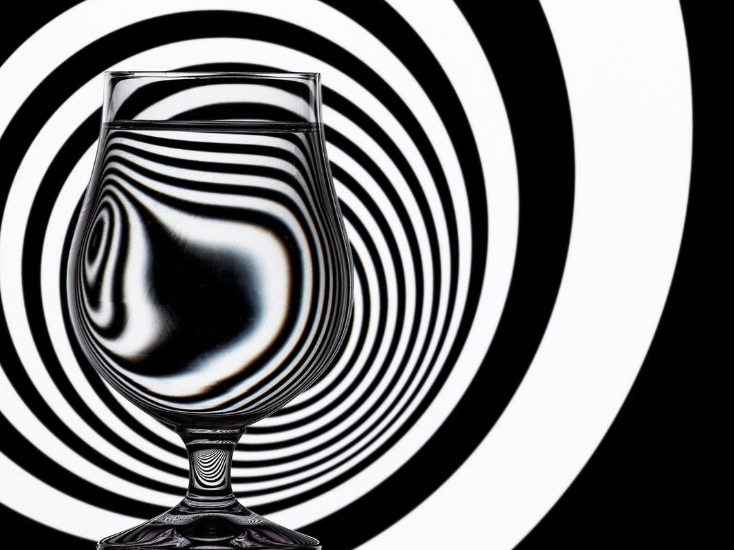
Steve Purnell is a photographer from Wales. Some of his work work is inspired by the Op Art movement. It is a style of visual art that makes use of optical illusions. Major exponents of this type of art were Victor Vasarely and Bridget Riley. In these images he uses striped backgrounds and also projected images that are distorted through water that is placed in bottles and glasses.
My Response
I made a series of images in the style of Steve Purnell's Op Art work. For this I used a selection of backgrounds displayed on a computer monitor. This meant I did not need to print anything out. I photographed three different glasses and a vase in front of each background.
What Went Well
Using backgrounds displayed on a computer screen was a good idea because I could alter the brightness of the display and rotate them. I thought the three glasses all gave a different interesting effect. I closed the blinds in the rooms to stop too much glare reflecting off the glasses. This meant the room was quite dark so I used a high ISO and large aperture.
Even Better If
I think that if I could have controlled the lights in the room without them reflecting on the glass I could have used a quicker shutter speed. I had to take about 100 photos to get 30 pictures that are worth keeping because so many of them were blurry. I could have used a tripod to help me avoid having so many blurry photos.
Top Three
Below are my three favourite images from the project. I have cropped and edited them in Photoshop.

Development - Ed Ruscha
 One of Ed Ruscha's Seven Products
Analysis
Ed Ruscha is an American artist associated with the pop art movement. He uses painting, printmaking, drawing, photography, and film. Ed Ruscha takes photos of objects that you wouldn't really see as art. He worked on a project entitled Seven Products. These black and white images are of everyday objects found in a normal household in the 1950’s. The images are taken at the same angle and viewpoint and are always on a plain white background.
My Response
I made a series of images in the style of Ed Ruscha's Seven Products. For this I chose seven products from my kitchen. I made a white background using sheets of A4 paper. I converted the photos to black and white using Photoshop. The finished black and white images and the original colour photos are displayed in the slideshow below.
What Went Well
I think the black and white versions of the photos look very similar to Ed Ruscha's original photos. I used light from the window to cast a nice shadow on the paper. When I converted the images to black and white I also added contrast which looks nice. I also used the healing tool in Photoshop to remove the lines between the overlapping sheets of paper.
Even Better If
I could have been more careful with the composition because I had to crop and rotate some of the pictures to make them look all the same. I also think I could have left more space around the larger objects. It required a lot of work to get rid of the overlapping lines on the sheets of paper. It would have been better if I had a single larger piece of paper to use as a background. Ed Ruscha's photos have a yellowish sepia tone to them instead of being pure black and white. I could have added a sepia effect in Photoshop to make them look more like his.
Development - Jesse Draxler
 Art by Jesse Draxler
Analysis
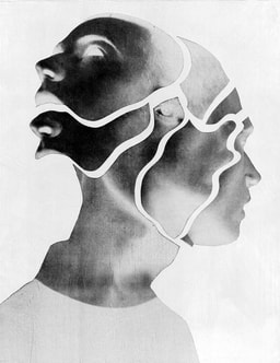
Jesse Draxler is an artist and photographer who currently lives in California. He works in many different mediums that combines collaged photography and painting. Draxler distorts and overlaps his models’ bodies and faces to form abstract forms and beings. His work is all in black and white because he feels colour is distracting.
My Response
I made a single image is the style of Jesse Draxler. I took a series of photos of a model and printed them out. I then cut them up and arranged them to form a new image. The separate pieces were arranged face down on a scanner to make the final image.
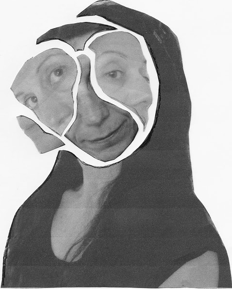
What Went Well
The photos I made of the model were good quality. I made six photos in total. I was worried that six wasn't enough, but in the end it was ok. I had to direct the model on how to pose for the six photos. I had a clear idea on how I wanted her to be positioned. The best part of this project for me was being well prepared for the photography.
Even Better If
I printed the photos quite small to save on ink. This meant that it was quite difficult to cut out the shapes. It would have been much easier if I has printed them very large. The edges of Jesse Draxler's pictures have a more interesting shape. Mine is not as good because of the shape of the model's long hair. I think if I had photographed someone with short hair or her hair tied back it would have meant the edges of my collage would have a more interesting shape.
