JR Chronicles – Saatchi Gallery
JR: Portrait of a Generation (2004 - 2006)
We visited the Saatchi Gallery in London to view an exhibition by JR. JR is a French photographer and street artist whose identity is unconfirmed. JR flyposts large black-and-white photographic images in public locations. He says that the street is "the largest art gallery in the world."
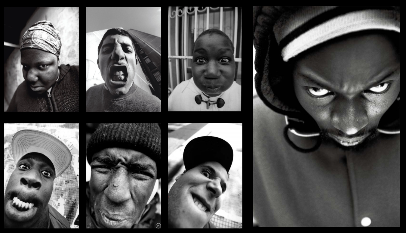
The photos in Portrait of a Generation show the young people who live in Montfermeil, which is a suburb of Paris. The people in the photos are all pulling scary faces.
In 2005 riots broke out in Montfermeil and spread through the city after deaths of two teenage boys who were hiding from police. A French MP called the rioters "Scum." JR wanted to challenge the way the public viewed the rioters.
JR used a 28 mm lens to shoot the black and white full-frame portraits. He then made very large prints of the pictures and displayed them across public walls in Paris.
Photos by JR.
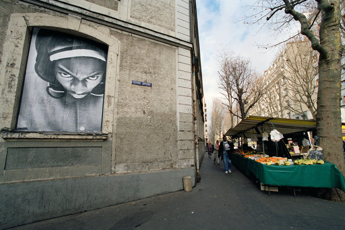
One of JR's photos on display in Paris
My Response
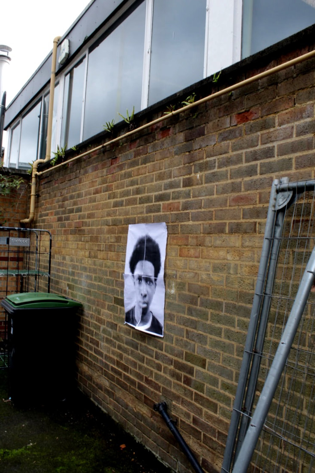
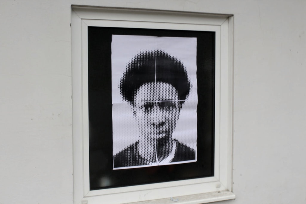
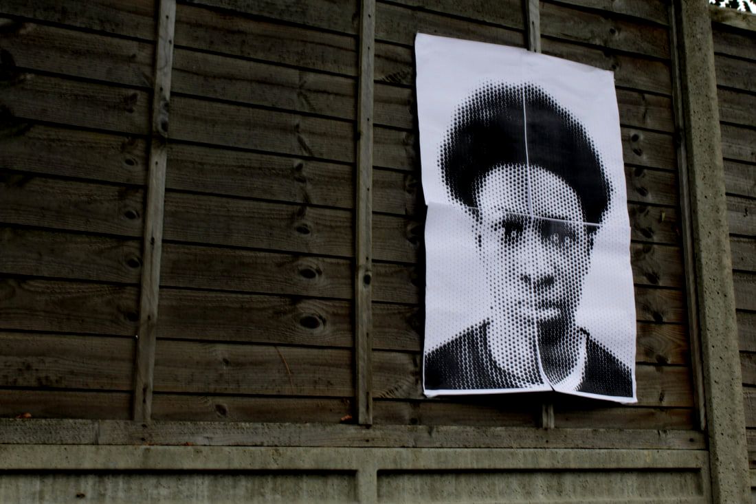
I made a series of images in the style of JR's Portrait of a Generation project. I used a DSLR to take a picture of one of my friends at school. I then used the website Rasterbator which allowed me to change picture to black and white. The photos are also turned into dots, which you see up close, but from far away just look like normal pictures. I hung the picture to the outside walls around school. I then took photos of it while on display to show how similar it looks to JR's work.
I made a series of images in the style of JR's Portrait of a Generation project. I used a DSLR to take a picture of one of my friends at school. I then used the website Rasterbator which allowed me to change picture to black and white. The photos are also turned into dots, which you see up close, but from far away just look like normal pictures. I hung the picture to the outside walls around school. I then took photos of it while on display to show how similar it looks to JR's work.
Editing the photo
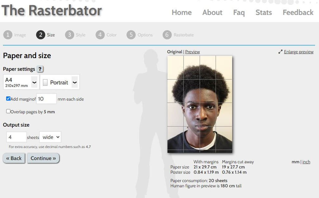
I used the website Rasterbator to edit my original picture.
I used the website Rasterbator to edit my original picture.
Step 1
I first uploaded the photo I wanted to use for the project onto the website. You can also change the output size at this stage.
I first uploaded the photo I wanted to use for the project onto the website. You can also change the output size at this stage.
Step 2
The next stage I chose what effects I wanted to add to the photo. I chose black and white rasterbation.
The next stage I chose what effects I wanted to add to the photo. I chose black and white rasterbation.
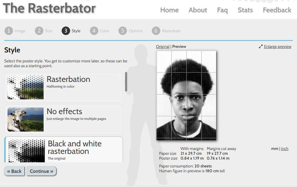
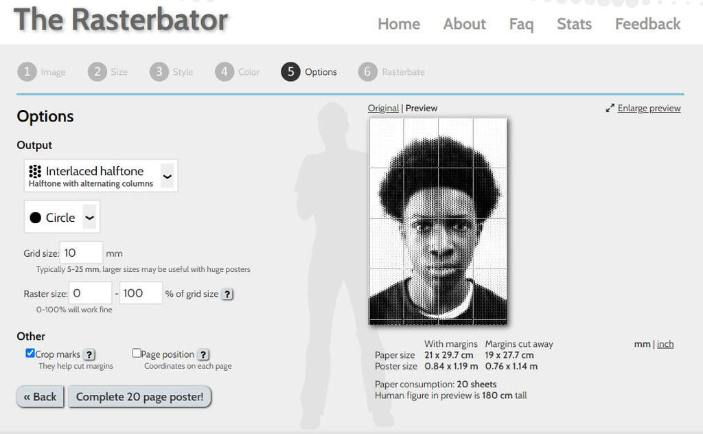
Step 3
Finally I selected interlaced half tone for the dotted effect. It allowed me to select circle shaped dots and the size of the dots. Once completed I download the photo to my desktop and printed it out.
Finally I selected interlaced half tone for the dotted effect. It allowed me to select circle shaped dots and the size of the dots. Once completed I download the photo to my desktop and printed it out.
What went well
I think the the process of using Rasterbator went really well. The website did a really good job of maiking the pictures look like JR's. When I stuck the pictures up, the pictures looked good with the different walls as a background. I also took lots of photos so it gave me a lot of options for what I liked most.
Even better if
I should have made sure the camera was focus properly when I was taking the photos of the hanging posters. I also could have given the photos of the poster more space so the viewer can see what the environment around it looks like.
Top Three
Below are my best images from the project showing the poster on display.
Gordon Magnin
Analysis
Gordon Magnin is a Nevada based artist who works with photography, scans and collages. Magnin grew up skateboarding and at a young age started getting into trouble. He later studied structural engineering and architecture. He uses inventive geometry, patterns, repetition and perspective to distort consumer based images. His work has been shown locally and internationally.
Gordon Magnin is a Nevada based artist who works with photography, scans and collages. Magnin grew up skateboarding and at a young age started getting into trouble. He later studied structural engineering and architecture. He uses inventive geometry, patterns, repetition and perspective to distort consumer based images. His work has been shown locally and internationally.


My Response
I made some images in the style of Gordon Magnin's work. For this I took portraits of classmates against a white background. I then used Photoshop to draw shapes over the photos. I rotated and moved the area inside each shape to distort the original picture. I finally converted the picture to black and white.
I made some images in the style of Gordon Magnin's work. For this I took portraits of classmates against a white background. I then used Photoshop to draw shapes over the photos. I rotated and moved the area inside each shape to distort the original picture. I finally converted the picture to black and white.
Below are two photos I made at school using the portraits shown above. For these I used circles to distort the photos.


At home I took some photos of my family and distorted them using the same method. This time I used circles and triangles as shapes. These are shown below.
What went well
I think when I edited the photos they looked very similar to Gordon Magnin's photos. Distorting the photos was quick to do as the step by step editing instructions were easy to follow. I was able to repeat the process with the pictures I took at home adding more complexity by overlapping the circles and using more than one shape.
Even better if
I think I got a little bit repetitive with the shapes and I could have mixed it up a bit more and used more complex shapes like hexagons.


Kehinde Whiley
Analysis
Kehinde Whiley is an African American portrait painter based in New York City. His work uses the poses and props seen in traditional portrait paintings. He finds his models on the streets of New York and asks them to choose a painting they want to recreate. Sometimes he already has an idea of the painting he wants to copy and will find someone to pose for it. He never asks the people in his portraits to dress up because he likes them to wear their regular clothes. His work provokes questions, challenges stereotypes and tries to present personal stories that celebrate the individuals in them.
Kehinde Whiley is an African American portrait painter based in New York City. His work uses the poses and props seen in traditional portrait paintings. He finds his models on the streets of New York and asks them to choose a painting they want to recreate. Sometimes he already has an idea of the painting he wants to copy and will find someone to pose for it. He never asks the people in his portraits to dress up because he likes them to wear their regular clothes. His work provokes questions, challenges stereotypes and tries to present personal stories that celebrate the individuals in them.


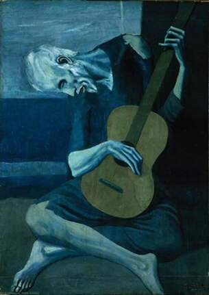 Old Guitarist Chicago by Picasso (1903)
My Response
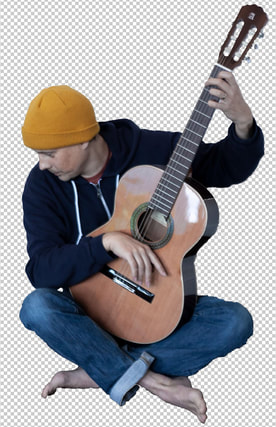
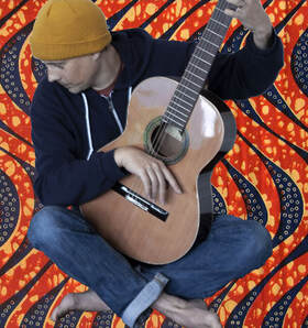
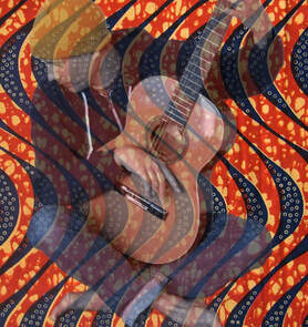
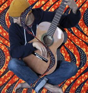
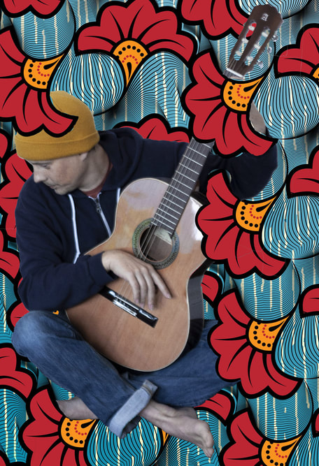
I made some images in the style of Kehinde Whiley's work. I chose a painting by Pablo Picasso called Old Guitarist Chicago made in 1903. I then I took some pictures of my Dad while he posed in a similar position as the man in the painting. These are shown in the slideshow below. I used some scans of fabrics similar to the backgrounds used in Whiley's pictures. I combined these with the photo of my Dad to make the final images.
I made some images in the style of Kehinde Whiley's work. I chose a painting by Pablo Picasso called Old Guitarist Chicago made in 1903. I then I took some pictures of my Dad while he posed in a similar position as the man in the painting. These are shown in the slideshow below. I used some scans of fabrics similar to the backgrounds used in Whiley's pictures. I combined these with the photo of my Dad to make the final images.
Editing the photos
Step 1
I first cut out the photo of my dad using the magnetic lasso tool in Photoshop.
I first cut out the photo of my dad using the magnetic lasso tool in Photoshop.
Step 2
I placed the cut out over the top of the background image. This allowed the cut out and the background to be on separate layers.
I placed the cut out over the top of the background image. This allowed the cut out and the background to be on separate layers.
Step 3
Using the opacity slider I made top layer semi transparent so I could see through to the bottom layer.
Using the opacity slider I made top layer semi transparent so I could see through to the bottom layer.
Step 4
I used the eraser tool to rub out the parts of the top layer that I wanted the background to show through. Once this was done I used the opacity slider to stop the top layer being semi transparent. Finally I flatten the image and saved it.
I used the eraser tool to rub out the parts of the top layer that I wanted the background to show through. Once this was done I used the opacity slider to stop the top layer being semi transparent. Finally I flatten the image and saved it.
What went well
I think the work I created looked similar to Kehinde Whiley's work. I took a lot of photos of my dad holding the guitar, which meant I had a lot to choose from when I selected the one I was going to use. It was the first time I used the lasso tool in Photoshop. This was more difficult than I thought it would be but the end result is ok.
Even better if
I could have been a bit more precise when I was rubbing out the top layer so the background could show through. It looks a bit messy. My first two pictures below are better than the second two. I think this is because I prefer the background in them. I could have chosen different backgrounds that are a good as the first two.
Below are the final four finished edits.
|

|

|

|
Almer Haser
 One of Haser's Cosmic Surgery images
Analysis
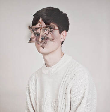
Alma Haser was born in 1989 and raised in Germany. She is now based in London and on the southeast coast of England. She is known for her complex portraits which are influenced by her creativity and her background in fine art. One of her projects is called Cosmic Surgery, where her portraits have their faces obscured by lattices of their own image. Her process involves printing multiple copies of portraits she has taken and folding them into origami structures. These are then placed onto a copy of the original portrait. She then photographs the result.
Alma Haser was born in 1989 and raised in Germany. She is now based in London and on the southeast coast of England. She is known for her complex portraits which are influenced by her creativity and her background in fine art. One of her projects is called Cosmic Surgery, where her portraits have their faces obscured by lattices of their own image. Her process involves printing multiple copies of portraits she has taken and folding them into origami structures. These are then placed onto a copy of the original portrait. She then photographs the result.
My Response
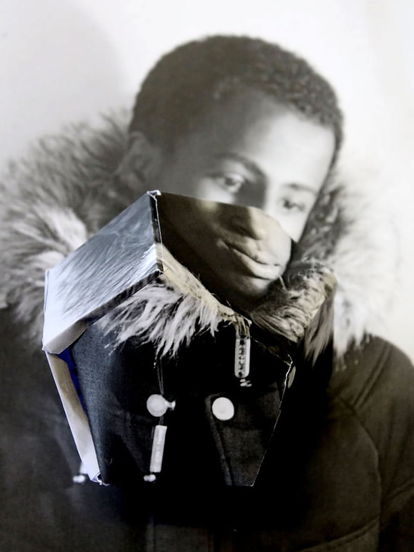
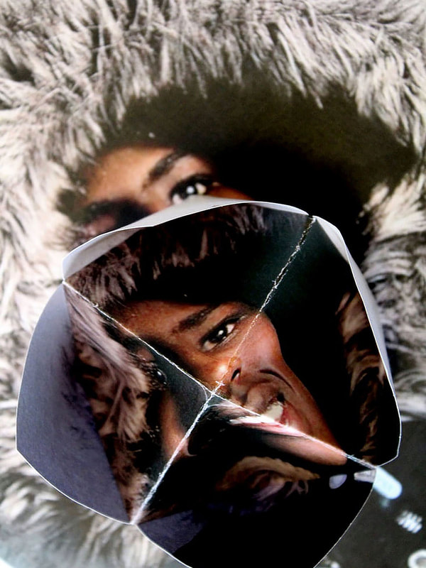
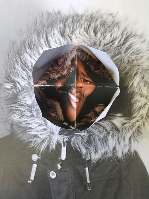
I made a series of images in the style of Almer Haser’s Cosmic Surgery work. First I took a portrait of a classmate. I made then two prints of it on large pieces of paper. I folded one of the prints into an origami shape. My teacher gave me a template for the origami shape. I then placed the origami shape over the second portrait print. I took several photos of the origami shape in different positions. Below is the slideshow of this work.
I made a series of images in the style of Almer Haser’s Cosmic Surgery work. First I took a portrait of a classmate. I made then two prints of it on large pieces of paper. I folded one of the prints into an origami shape. My teacher gave me a template for the origami shape. I then placed the origami shape over the second portrait print. I took several photos of the origami shape in different positions. Below is the slideshow of this work.
What Went Well
This was an interesting project because the origami added a 3d element. The instructions for folding the the origami shape were clear and it was fun to do. The final three images work quite well as they look similar to Haser's work.
Even Better If
I could have been more careful with folding the paper as it's a bit messy. I also think that I should have shot a new set of portraits to use especially for the project, instead of using older images. I could have also tried to used better lighting when taking the final pictures.
Top Three
Below are my three best images from the project.
Patrick Cornillet
Analysis
Patrick Cornillet is a French painter born in 1968. His painting are very realistic and look almost like photographs. His work investigates issues concerning the ugliness of modern architecture and the environment. He draws buildings or parts of buildings without the context of their environment. They have no people, scale and often no sky.
The isolated concrete makes us aware of the materials and of the remains left by the humans and of time passing by.


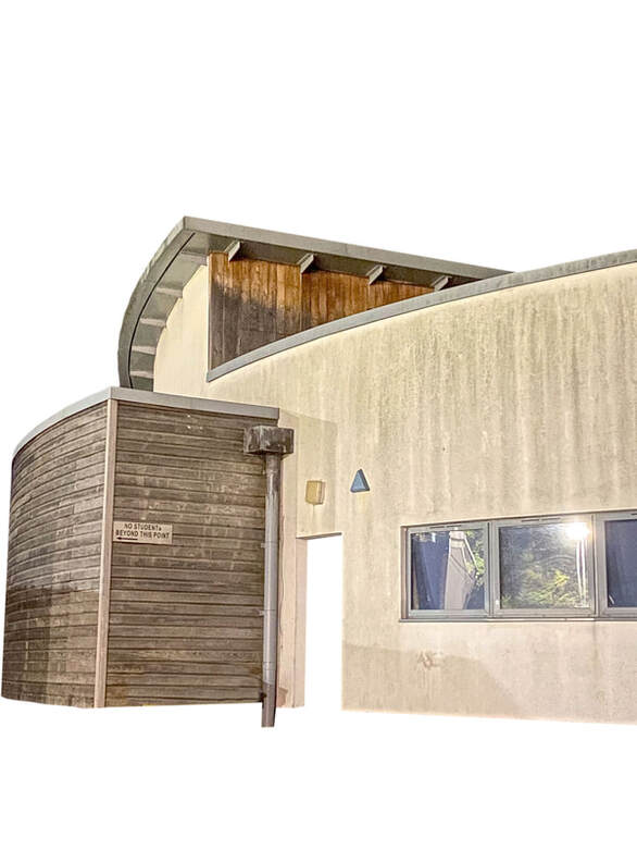
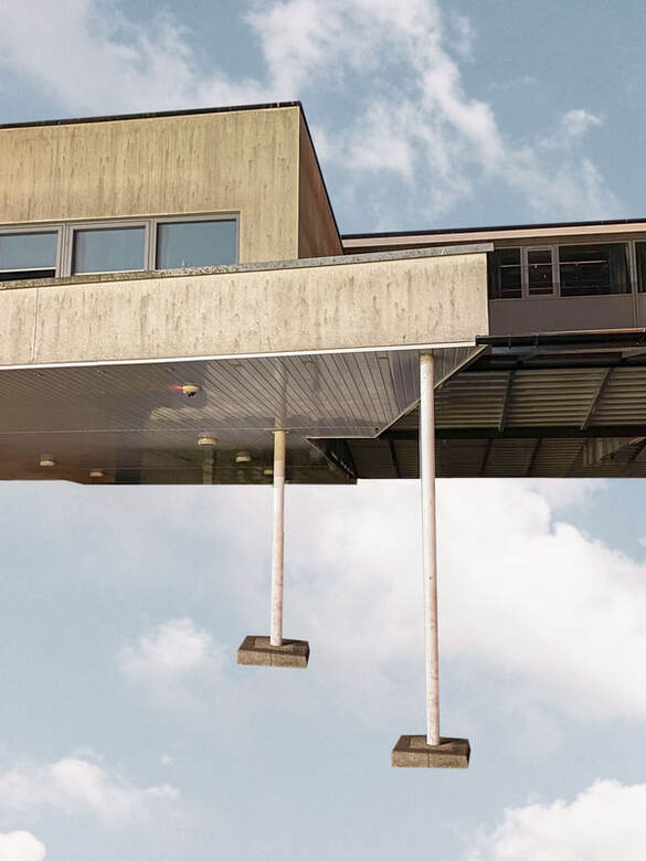
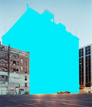
My Response
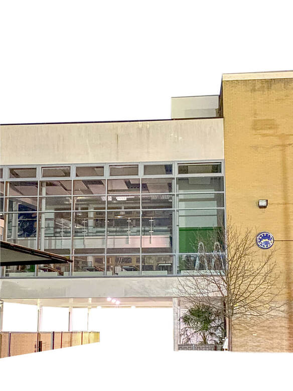
I made some images in the style of Patrick Cornillet's work. To do this I first had to find some buildings similar to Cornillet's work. I shot a local school that has a grey modern concrete look. I then chose my three favourite pictures from the shoot and edited them. I used Photoshop to remove the background and foreground from the picture to leave only the buildings floating in white space. For one of the images I placed the building on a picture I took of the sky, which is one of the techniques Cornillet uses.
Below is a slideshow of my photoshoot.
What Went Well
The location I found for the images was good because the building are simple and made from concrete like the buildings Patrick Cornillet paints. I used Photoshop to cut the buildings out from their surroundings. To do this I used the lasso tool to select the areas I wanted to delete. I also used the pen tool to draw around the areas to delete. Both methods worked well. I think this is because I took the pictures at night with the building lit up. It made it easy for Photoshop to find the difference between the light foreground and dark sky. The final three picture look like Patrick Cornillet's work and I really like the one where I placed the building over a picture of clouds in the sky.
Even Better If
I think I should have taken more pictures of the buildings. I don't think some of them are very good because I've included other objects like trees, fences and bushes. I also think I could found some other places to photograph such as stairs or bridges instead of trying to fit in a whole building into the pictures.
Top Three
Below are the three images that I edited.
Maureen Brodeck
 One of Maureen Brodbeck's pictures
Analysis
Mauren Brodbeck is a Swiss artist who uses visual elements to create reinterpretations of common objects. Her work invites the viewer to reconsider their relationships with the environments around them.
Maureen Brodbeck's Urbanscape and Cityscape project involves changing photographs to create focus on specific buildings. She does this by colouring in buildings with interesting shapes.
These photographs use vibrant colours over a dull urban setting. By doing this a cartoonish element is given to real world landscapes.
Brodbeck's pieces can be found in a number of private, public, and museum collections.
My Response
I made some images in the style of Mauren Brodbeck's Urbanscape and Cityscape work. I did a photoshoot of some of the buildings in the area I live in. I tried to photograph modern ugly buildings that have been built next to old architecture. I then coloured in the modern buildings in Photoshop. To do this I used the pen tool or the lasso tool to select the outline of the building. I then used the brush tool or paint bucket tool to colour in the selected areas a nice bright colour.
Below is a slideshow of my photoshoot before I edited them.
What Went Well
I thought the shoot went really well because I live in an area where the are different style of architecture next to each other. I took the photos in the evening so some of the buildings were lit well by the setting sun. It was easy to find buildings that stood out in the environment. This helped with selecting them in Photoshop for the colouring process.
Even Better If
It was quite difficult to find compositions that didn't have cars in or people walking across them. I think if I had gone to a quieter location or taken the pictures at a different time of day it would have been easier to avoid distractions.
Top Four
Below are the four images that I edited.


Thomas Kellner
Thomas Kellner is a German photographer. He became known for his photographs of famous architectural monuments, which are fragmented into many individual images to look like photo mosaics. Each final image consists of at least thirty photos.
Kellner works with a single-lens reflex camera and 35mm film. After developing the film, Kellner cuts it into strips of equal length and assembles them into one large negative. This is then used to produce the contact sheet, on which the meta-information about the film and the respective number of the shot is still visible. Usually photographers use the contact sheet to make a selection of the photographed individual images, which are then enlarged. Normally it is never part of the finished photographs. Kellner allows for the information to still be visible on the film in his finished photographs.
Kellner works with a single-lens reflex camera and 35mm film. After developing the film, Kellner cuts it into strips of equal length and assembles them into one large negative. This is then used to produce the contact sheet, on which the meta-information about the film and the respective number of the shot is still visible. Usually photographers use the contact sheet to make a selection of the photographed individual images, which are then enlarged. Normally it is never part of the finished photographs. Kellner allows for the information to still be visible on the film in his finished photographs.
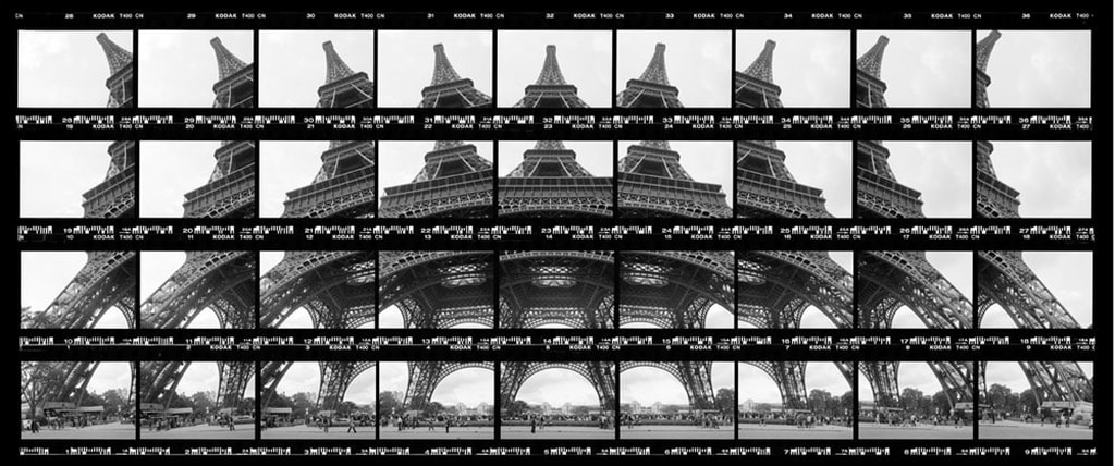
Thomas Kellner's image of the Eiffel Tower in Paris
My Response
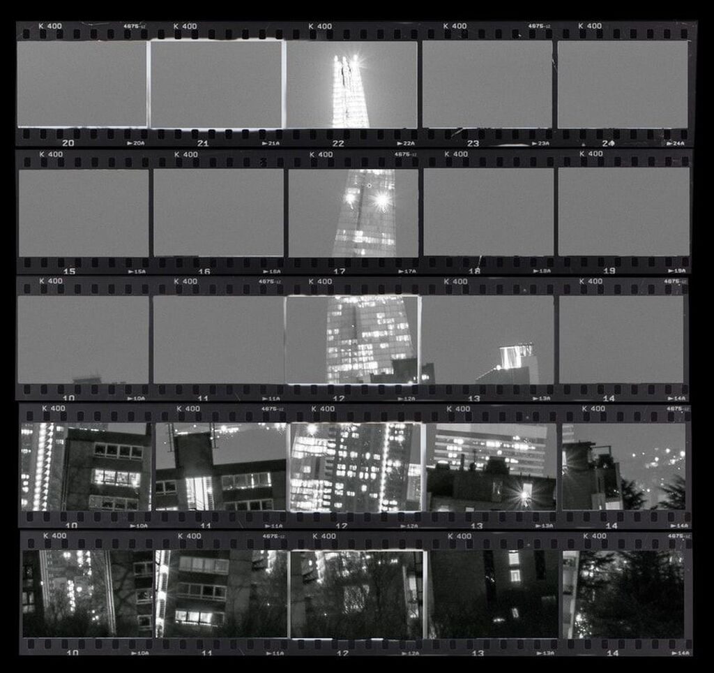
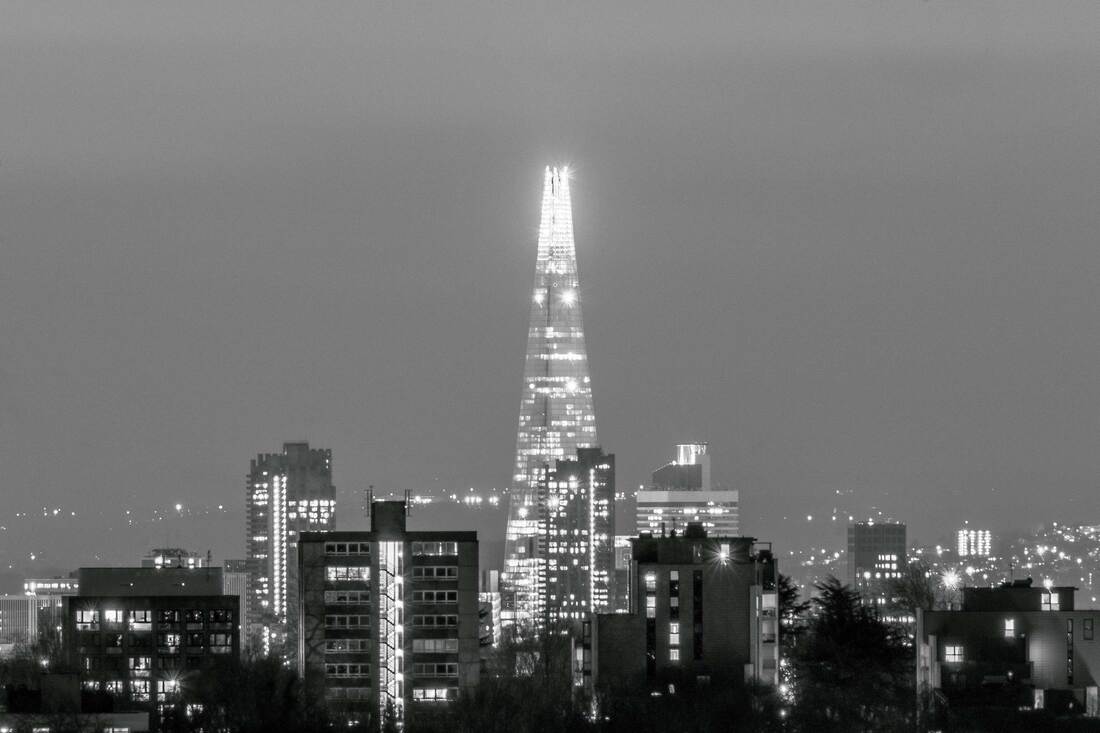
I made an image in the style of Thomas Kellner's work. I chose to take a photo of The Shard building in London and edit it to look like one of Kellner's contact sheets. The process involved duplicating the photo several times and placing the duplicate layers at different angles. I then used a contact sheet template to place over the top of the image. I then deleted parts of each angled layer beneath the contact sheet layer. This allowed each window of the contact sheet to show different angled areas to show through.
Below is the original photo of The Shard, which I converted to black and white before working on it.
What Went Well
I wanted to use a famous building that people recognise. It was easy to take the picture of The Shard as I live in London. The layering and changing the angle of each layer was easy to do and the contact sheet template was supplied by my teacher, which looks really good in the final picture.
Even Better If
I think that too much of the final image is sky. This makes the picture a bit boring in the top part. I think I could have found a different building that would have filled more of the picture, or taken a picture of The Shard from a closer and different angle.
Final image
Below is the final image I made.